Monday, January 19, 2015

The Black Kitchen

It seems like an unlikely color for a kitchen, but black can add a sense of sleek glamour or, surprisingly, a sense of traditional history. I know the idea of a black kitchen may make you a tad nervous, but bear with me as we journey through the following spaces...

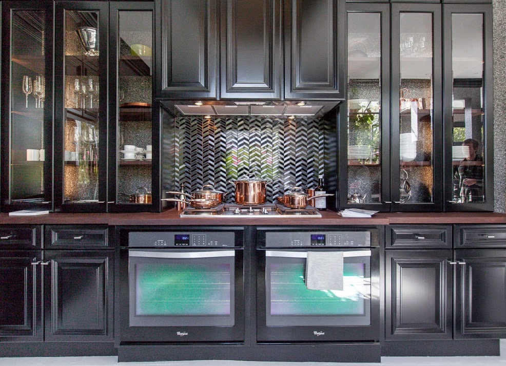
Black seems an easy choice for modern or minimalist kitchens. The flush black cabinetry in the photos below seem to be part of a sci-fi film. But in the third photo, the infusion of black comes from the shiny black penny round tiles on the wall and the fantastic black granite island and counter tops.


This über-glamorous, metropolitan kitchen by Miles Redd makes every culinary moment there a black-tie event.


Black plays well in more traditional kitchens too!


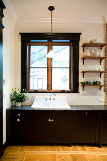
This black kitchen by Elizabeth Roberts, below, is not entirely black thanks to the play of warm wood tones and aged brick. In this context, the sense of New England history is present in this four-square house with the whimsical addition of a canoe frame suspended from the ceiling.


Black can be tempered further as seen in this very traditional kitchen by Patricia Stewart who used an under-color of midnight blue or purple on the island to give the black units some extra depth.


I was fortunate enough to see Steven Miller's stunning black kitchen, named House Beautiful's Kitchen of the Year for 2014, at the San Francisco Decorator's Showcase this past May (which I wrote about here). The end result, full of light, was a space of stately elegance but also, interestingly, of a sense of restraint.


If the thought of all black kitchen cabinetry makes you nervous, how about just the base units? It grounds the space and lends an air of sophistication...


And if that thought still makes you nervous, do what food celebrity Tyler Florence did in his own home and put black subway tile on a single backsplash wall. You still get a dramatic statement without committing to too much black...


Happy designing!

Monday, January 12, 2015

The Zen Bathroom by Fiorito Interior Design

As I have mentioned in past posts, inspiration can come from many sources. And sometimes the inspiration for a style direction is simply to move away from what is currently there!

After my clients purchased a new home, they came to me for help with a whole-house renovation in order to get rid of the style (and a few odd, ill-conceived choices) of the previous owners. In the renovation, we knocked down some walls to add another bedroom, an office, and a laundry room to the east wing of the house, and consequently we were able to completely re-think this guest bathroom. It suffered from a very 90s tan and brown faux-"Tuscan" facelift with heavy, thick tan granite counters, heavy brown cabinetry from a big box store, and tan walls. Oh, and did I mention everything was tan and brown? With so little definition, the room felt sort of invisible... and sad.


My clients did not like the window in the bathroom which was unfortunately placed, as seen from the outside of the home, next to the front door (Ding-dong! "Just a sec," your visitors hear you yell from right next to them, while seeing your shadow on the john). And they felt that a tub was not needed in the guest bathroom. We also took the opportunity to remove the large--and I mean very large--niche in the tub which literally pushed into a closet in the room on the other side. It was a very odd sight to open the closet doors in the next room and see a big looming box extending out from the back of the closet wall, effectively rendering any hanging space in that portion unusable.


In an effort to give my clients, who lean toward minimalism, something completely different, my vision for this room was light and fresh, streamlined but organic, with a Zen influence. During construction, we removed the large tub and very awkward niche to make room for a shower and enclosed water closet. Since we lost a window, we created privacy (much welcomed by my clients) but added light with a skylight placed over the new shower as well as a wonderful trough skylight placed over the length of the vanity. And we did all this without changing the footprint of the original space.

In the images below, you can see that the floor and shower enclosure are tiled in a weathered blue-grey porcelain that looks like patinated metal. A glass mosaic strip of blue, grey green, copper and bronze was placed as an accent in the shower and in a border to create a “rug” on the floor. A double sconce with a gentle, organic curve graces the mirror and doubles the light. The warm cherry tones of the wood on the custom vanity and mirror grounds the space while the simple brushed steel of the hardware and square shape of the faucets lends a tranquil, Zen feeling. Finally, the walls were painted a very light sky blue to finish off the organic, calm feeling.


If you have a bath that lacks style or definition, do not despair: please give me a call!
Happy designing!

Monday, January 5, 2015

New and Bright

Welcome to 2015, a new year, and in the spirit of "new," let's look at a marvelous lighting project completed by French artist and designer Mathieu Lehanneur, who has created objects, furniture, installations, products, and retail stores.

For his project entitled "Les Cordes," the idea of a chandelier or ceiling light is stripped down into something new: entirely minimalistic, functional, and futuristic, but still breathtakingly lovely. The organic-looking cords of LED lights seem to drip from and return to the ceiling plane on their own. And I just love the contrast between this spartan, futuristic sensibility and the Beaux-Arts style of the building, Château Borely, in Marseille. Remember Design Mantra #1: Contrast brings interest!


This amazing concept can certainly be adapted to fit into a residential interior design scheme, on a ceiling... or maybe even on a wall! If you are dreaming of something new and different for your home, give me a call! Let's create something new together.
Happy designing!

Monday, December 29, 2014

Monday, December 22, 2014

Happy Winter Solstice and Happy Holidays 2014!

Yesterday was the Winter Solstice, the shortest day and longest night of the year. Wishing everyone all the joys of the season.


Happy Holidays!

Monday, December 15, 2014

Cabin Style in the Adirondacks

Style author Amanda Brooks' winter family home in the Adirondacks was designed by her mother, Elizabeth Stewart. Come this time of year, it is decorated as a rustic winter paradise! This is great example of a type of site specific design that works well in a particular setting, and all the elements here are absolutely perfect to ride out a snow storm in glorious style: rustic stone and wood, a smattering of Native American textiles, a few traditional antique pieces mixed in, and pine boughs...all elements that you can bring into your own home for a touch of classic holiday style.


It all reminds me of a lovely Christmas I once spent at the iconic Ahwahnee Lodge in Yosemite National Park. It's gorgeous...


Happy designing and Happy Holidays!

Monday, December 1, 2014

Three Traditional Holiday Decorations: Schwibbogen, Christmas Pyramid, Angel Chimes

A Schwibbogen is a decorative candle-holder from Germany. Associated exclusively with winter and the holiday season, the first Schwibbogen appeared in the 1700s. They were made from black iron ore since they originated in Erzgebirge, or the Ore Mountains in Saxony. They are now often carved in wood and show scenes from pastoral Europe, musicians, angels, or Father Christmas. Modern Schwibbogen come with small electric bulbs eliminating the need for actual candles, and eliminating a fire hazard!


Related to the Schwibbogen and hailing from the same region of Germany is the tradition of the Christmas Pyramid whose origins date back to the Middle Ages. Usually carved or assembled from wood, the Christmas Pyramid is a carousel with several levels and a central driveshaft with a fan at the top. Candles anchored around the periphery of the lower levels provide a heated draft to turn the levels like a carousel.

Above: A carved wooden Christmas Pyramid and Schwibbogen from Germany.

Many cities in Germany now display impressive life-size Christmas Pyramids at Christmas Markets or in town squares. In the photos below, a Christmas Pyramid in Augsburg in the Christmas Market looks festive while a very tall Christmas Pyramid rises above the lighted tree in the Market in Erfurt.


Dating from the late 19th century, Angle Chimes too are associated exclusively with winter and the holiday season. Much like the Christmas Pyramid, the rising heated air from the candles at the base of the structure spin the blades at the top. As the carousel turns, tiny clappers strike the chimes creating a tinkling sound. The first recorded appearance of an Angel Chime was in 1905 when Walter Stock of the German toy firm Adrian &  Stock filed for a patent. The pre-World War II German-made chimes were usually made of tin and featured lithography. After the war, simpler, Swedish-made chimes in brass became popular in both Europe and North America.

Above: Walter Stock's patent drawing from 1905


However you choose to accessorize your season, I wish you Happy Holidays and happy designing!

Know Your Sofas: The Queen Anne Settee

Although certain details and elements were developed during her actual reign (1702-1714), the name "Queen Anne" to designate a furniture style was not used until nearly a hundred years later. The Queen Anne style can be seen as a refinement of the silhouettes and ideas from the earlier William and Mary period. The rather rectilinear William and Mary pieces used curves in applied decorative elements like inlay or marquetry. But Queen Anne pieces incorporated curves, S-scrolls, and C-scrolls into the shape of the furniture itself creating graceful, much more delicate lines than had ever been seen before.

While technically not a sofa as we know it today, the Queen Anne settee was, at that point in furniture history, the closest thing yet to a sofa. Unbeknownst to them, furniture makers of the day were working toward the concept of a sofa, and this was a step in its evolution. The execution, while structurally proficient, is actually a little comical: it looks like two chairs grafted together to make a larger sitting area. Which makes sense. If you wanted a chair that sat more than one person, well, why not put several chairs together and have them share a seat deck?


Even though the embellishments of prior styles like Rococo and William and Mary were muted, one can still see an occasional shell or acanthus leaf on a leg or back...


The Queen Anne settee was also made in three and four chair backs as well!


An important feature of Queen Anne pieces is the cabriole leg terminating in a pad (or club) foot, or in later incarnations, in a claw and ball foot (see photos below). This shape of leg has been in use since the early Greeks and Romans, but it was perfected in European furniture during this time. It was the Queen Anne style that saw the elevation of the cabriole leg into a sweet, sweeping, gentle curve. It is called a cabriole leg because of its resemblance to the slender hind leg of a deer or goat: in French, the word cabrioler means to spring or leap like a goat. The shape is always convex at the top and concave at the bottom. Because of this, the anthropomorphic sense makes it seem as if these pieces of furniture skitter about, chasing each other on the hardwood floor when no one is home!


Pad or club feet, seen above, are cabriole legs which end in what looks like a golf club.


And claw and ball feet are literally just that: a claw with its talons gripping a sphere.

These days you are likely to see a Queen Anne element like a cabriole leg (the most common) or a claw and ball foot on a more current piece of furniture as well. Keep you eyes peeled and happy designing!