After the opulence, glitter, and excess of the holiday season passes, my mind usually turns to more simple forms and styles. After the shiny ornaments are put away, we are left with bare branches and grey skies. With this in mind, this installation of History of Furniture focuses on two simple, sleek styles from the early part of the 20th century known as Bauhaus, or International Style, and its counterpart De Stijl (deh STEEL).
The Bauhaus School was founded by architect Walter Gropius in Weimar, Germany in 1919. The Bauhaus Manifesto touted the unity of all arts, and emphasized the idea that artists are actually craftsmen. "Salon art" is a "world that must build again," according to the manifesto. "Let us then create a new guild of craftsmen without the class distinctions that raise an arrogant barrier between craftsman and artist! Together let us desire, conceive, and create the new structure of the future..." Gropius proclaimed that "we want an architecture adapted to our world of machines, radios and fast cars." The Bauhaus school was heavily influenced by Modernism. The long list of teachers and students who graduated from the school forged a new, abstract, spartan sensibility that went on to influence generations and decades to come. The movement's influence can still be felt, especially with the return in popularity of Mid-Century Modern design.
Concurrently in The Netherlands, a similar idea was brewing in a movement called De Stijl, or "the Style," founded in 1917, in which total abstraction and a simplification to basic shapes and colors was promoted. Although the two movements are referred to under their respective names and produced work that is identifiable as belonging to one movement or another, there was enough crossover and similarity to warrant my presenting them together for this post. In fact, Dutch painter and De Stijl founder Theo van Doesburg moved to Weimar to teach at the Bauhaus.
The Bauhaus style announced itself in the main structure when the school moved from Weimar to Dessau. The no-nonsense concrete, steel, and glass elements set off the Bauhaus font beautifully.
The furniture, rugs, and pottery that came out of the school were equally as severe, startling, and ultimately functional as the building itself. Take a look.
The famous Bauhaus child's cradle designed by Peter Keler was a traditional idea distilled down to only what was necessary for its function. Keler used a theory of color and shape developed by one of his teachers, the painter Wassily Kandinsky, to fashion the piece from a square, a circle, and a triangle.
Below we can see the classic lamp designed by Bauhaus follower Wilhelm Wagenfeld. Next to it are some multi-colored Bauhaus nesting tables. As always with Bauhaus, form (and style) follows function.
One of the most famous Bauhaus designers (both a student and later a teacher) created one of the most famous chairs in history: the Wassily Chair by Marcel Breuer. It was revolutionary at the time because the German steel manufacturer Mannesmann had recently perfected a way of producing steel tubing without any seams, making the bend of the steel frame possible. The taut black leather gives it a very architectural look.
Breuer also created one of the most copied chairs of the 20th century, the Cesca Chair, made of steel tubing and a woven cane back and seat. My parents had these chairs at our dining table when I was growing up.
Meanwhile in The Netherlands, De Stijl designer Gerrit Reitveld was almost single-handedly changing the way the Dutch saw furniture. He had a close artistic friendship with the artist Piet Mondrian whose rigid canvases of squares and rectangles served as inspiration and fodder for Reitveld's own ideas about the nature of design, and the importance of horizontal and vertical planes.
His most famous chair, the Red and Blue Chair, held to the De Stijl self-imposed restriction of using only primary colors along with black or white.
He created many other pieces, all adhering to the same properties and ideas he developed. Below we can see a buffet, a side table, his iconic Zig-Zag chair, and finally, his masterpiece, the Berlin Chair.
We can see echoes of Bauhaus and De Stijl in subsequent design movements like Mid-Century Modernism in the 1950s, clear through to the 1980s with the Memphis Style, both of which we will be examining in future posts.
In the meantime, happy designing!
Monday, January 27, 2014
Monday, January 20, 2014
An Island Bathroom by Fiorito Interior Design
People often ask how I, as a designer, choose materials/ colors/ finishes or a style for a particular job. While inspiration can come from anywhere, most often it comes from my clients themselves. I like to get to know my clients while developing a space for them. It helps to inform my choices and to tailor a personalized space that is sure to please my clients.
Such was the case with a recent guest bathroom remodel. My clients, a couple with grown children, love to vacation on Maui as often as their schedules will allow... and this sparked an idea. In my mind, I saw a bathroom that would pay homage to the idea of a tropical island getaway, and remind them when they are here on the mainland of why they love going to Hawaii. They loved the idea, so I chose materials that bring to mind volcanic rock and island stones, bamboo wood tones, and the warm blue of tropical waters.
But before we go any further, let's see what the bathroom looked like when I first saw it.
Stylistically, the bathroom was like an archeological dig. Their home was built in the 1950s (pink sinks and shower), but the bath had last had a facelift in the 70s (earth-toned foil wallpaper). While it was still functional, there were many things that made being in the bathroom subliminally uncomfortable such as the enclosed shower stall with a lowered ceiling height, and a heavy looking soffit threatening to drop on anyone standing at the vanity. These architectural elements only served to compartmentalize the space, making it appear smaller.
There was no choice but to gut it all and start from scratch. Since this is a guest bathroom, we chose to install a single sink which allowed us to buy more vanity storage and counter space. Keeping Maui in mind, the use of natural wood, Mother-of-Pearl shell mosaic sconces mounted on a framed mirror, sand-colored granite, water-y toned crackle glass tiles, and ocean-colored ceramic crackle glazed door and drawer hardware achieves the feeling of being at a spa resort in the tropics.
The new glass-enclosed shower was clad in a tile with a rock-like pattern reminiscent of split bamboo, while a crackle glass "waterfall" cascades down the hardware wall.
The shower floor is lined with pebbles from Island Stone; the same material is featured in a "rug" on the mossy green floor of the bathroom, which is now a constant comfortable temperature thanks to under-floor radiant heat.
Clean-lined shower and sink hardware give the space a tranquil sense so my clients can feel as if they are vacationing in paradise everyday.
Inspiration is never far away. Look at the things you love and you are bound to find a style direction!
Happy designing!
Monday, January 13, 2014
Know Your Chairs: The Klismos
We have the ancient Greeks to thank for the marvelous design of the klismos chair. Coming from the ancient Greek word klinein which means "to lean," this elegant chair can be seen depicted on vases and pottery from Greek antiquity.
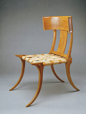
Klismos chairs were originally made of wood with seats of cane or of woven leather. The swooping delicate line of the chair comes from its saber legs which curve out. The back rest continues the curve upward but in the opposite direction, giving the silhouette of the chair a beautiful "S" curve. A low, concave panel supported the sitter's back. While there are really no extant klismos chairs to speak of, we can find plenty of imagery showing its shape and construction not only from the Greeks but also from the Romans who emulated nearly every aspect of Greek culture.
The chair was quite popular during the classical Greek period but fell out of usage by the Hellenistic period. Some theorize this is because the chair's delicate saber legs contributed to instability, causing the piece to splay out and break. One would think that with a design flaw that serious, the chair would never have been widely used to begin with. I feel the decline of the chair simply has to do with changing tastes of style and fashion. Whatever the reason, it seems that the shape is too exotic and alluring to resist and the chair saw a huge rise in popularity in the late 1700s when all of Europe was interested in Neo-Classicism. Greek and Roman sites were being excavated, pottery was being unearthed and images of the klismos chair were discovered!
The klismos came back into favor in the late 1930s--look at T. H. Robsjohn-Gibbings' very faithful 1937 reconstruction above--and continues to be widely used today. Due to its simple lines and streamlined shape, the klismos can fit in with practically any décor scheme, from traditional to modern.
I came across this Bernhardt Gustav chair, which is a klismos chair in polished chrome, at a furniture showroom recently and I am beyond eager to use it for a client.
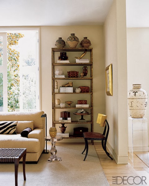
And if my client-to-be does not like chrome, I can get them one in a warm toned gold brass! Designer Will Wick used this De Sousa Hughes klismos chair, below, in a library to great effect!
It can even be found in acrylic...
The klismos chair is timeless and extremely versatile. Its presence is lyrical and sculptural. Maybe you could use one--or several--in your home!
Happy designing!
Monday, January 6, 2014
New Year, New Life, New Nurseries!
Welcome to 2014 everyone! We survived and are still here to see another year... and good for us!
A New Year always brings with it the idea of beginnings, new ventures, and fresh starts, even if it is a culturally imposed idea. However artificial, it is an exciting concept to be able to wipe the slate clean and prepare for something completely new.
With this in mind, I give to you my thoughts about nurseries and baby rooms: one of the great interior design dilemmas. Now, I am aware that parents who are expecting are caught up in a whirl of excitement. They are entering into unknown territory and preparing for a lot of change in their lives. So perhaps that is why many parents fall back on tired, expected, clichéd nursery design ideas. I also know that parents are excited to be expecting a boy or a girl (if they choose to discover such information ahead of time) but when I see a pink "girl-themed"/ princess nursery or a blue "boy-themed"/ cowboy-nautical-truck nursery, I feel it is a missed opportunity: a nursery can be as eclectic, stylish, interesting, and dramatic as any other room in the house.
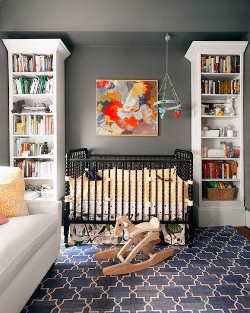
Take for example, this lovely and very sophisticated nursery by Erin Gates. Classic and stylish elements are set off against fantastic warm gray walls. And the painting is a beautiful addition of color and form.
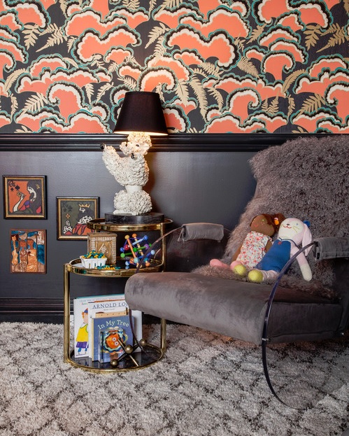
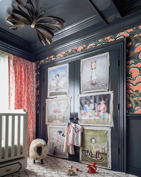
Now, this spectacular nursery by the equally spectacular Tamara Kaye Honey features a slate and coral palette within a Hollywood Regency style. The wallpaper is amazing, and the brass butterfly on the ceiling and the spooky-cool paintings tacked to the closet door make the space.
Designer Summer Thornton used Scalamandré's legendary zebra-print wallpaper in this eclectic nursery that blends vintage, Hollywood Regency, and whimsical as well as ethnic elements into a tantalizing, pleasing mix.
This bright, inviting nursery by Lucas Studio is more like a lovely guest room. The color palette and pattern-mixing are superb, lending a sun room or garden room feel.
Lovejoy Designs created a fresh, clean nursery in pale celadon and persimmon. Light and refined. The orange is a perfect counterpoint to the serenity of the celadon and adds a spark of life.
A nursery does not have to be Disneyland or an imposed gender statement. Use your imagination... don't fall back on common, stereotypical "baby" rooms. There are and should be no limits. You can even put a photo mural on a nursery wall of a Slilm Aaron's Palm Springs image, shown below, and make your baby's early years into a fabulous mid-century, jet-set adventure!
http://eringatesdesign.com/
http://houseofhoney.la/
http://www.summerthorntondesign.com/
http://www.harbingerla.com/
http://www.lovejoydesigns.net/
So if you or someone you know have cause to create a nursery, congratulations! Second, think outside the nursery room box when creating a space for the new tenant! Let your imagination roam and happy designing!
Subscribe to:
Posts (Atom)


