This weekend I attended, as I do every year, the San Francisco Decorator's Showcase which takes place at a different mansion, usually somewhere in Pacific Heights in San Francisco... and this year, the Showcase was in an Elizabethan styled home Julia Morgan designed in 1917. The six-bedroom, eight bath house is modest when compared with others in the neighborhood, despite the fact that it sold for $18 million. But it is still stunning, sitting a stone's throw from the Presidio and with its views of the Bay.
This year's crop of designers did outstanding work and the intriguing design sensibility started with the entry by
Candace Barnes. Her decision to install an extremely large-scale painting obscuring the stairway was a bold one. But when approached from a design standpoint, there was really no other way to make a statement and ultimately, it works very well, anchoring the space and establishing a backdrop of a color and texture that is carried throughout the rest of the entryway with quartz obelisks on a zinc console table and a pair of croc-covered stools. The Japanese maple is a brilliant touch to balance out the stairwell entrance on the opposite side. And the cherry on the cake of her entire foyer is a marvelous Lasvit glass-rod chandelier. Gorgeous.
Some years there are rooms that grab me the moment I see them and I end up just standing there, taking it all in for quite a while before I even begin to come to my senses.
Julie Rootes' powder room was such a space for me, but being a powder room made it all the more difficult for me to stand stunned since, as I reminded myself while hogging the tiny space, "Other people need to see the room too, Jeff..." There is so much amazing texture and interest in such a small space here. Below the wainscoting is a 24-karat gold and onyx mosaic tile topped with a wallcovering in similar tones. The vanity is of a rough-hewn calacatta gold marble. And to echo the unique honeycomb design in the wallcovering, Rootes custom made a similarly shaped gold-leafed metal niche to house lovely objects. Wow.
This year's living room is an homage to Yves St. Laurent designed by
Phillip Silver. It is elegant and tailored like a St. Laurent piece, but the overriding motif seems to be minerals and gems. Amethyst geodes appear over the fireplace, two floor lamps made of selenite flank the grand window, decorative glass objects faceted like jewels lay about, and furnishings come in modest jewel tones like citrine and carnelian. Even the camel colored draperies are lined with a soft, serious pink. The chandelier in the center of the room is a silvered branch dripping with crystal drops.
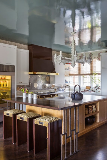
The inviting family room/kitchen area is full of surprises.
Kathleen Navarra layered a lot into the open plan area but it does not feel busy or burdened. The first thing I noticed when I walked in was the glorious high-gloss turquoise ceiling! Beautiful pendants and perfect drapery fabric make the eat-in area stand out. The mosaic tile wall behind the flat screen TV carries across the wall and becomes the backsplash in the kitchen which features a rich chocolate brown range and hood by La Cornue. The glass and mirror backsplash over the range etched with a dandelion design is an unexpected touch. But the sweetest moment--perhaps in the entire Showcase--is what Navarra did with the unused space below the back staircase. Instead of making Harry Potter live there, she fashioned it into a luxurious doggie retreat! Food and water bowls and a faux-grass piddle pad are in pull out drawers beneath a sumptuous doggie bed (complete with bolster pillows!) surrounded by a mural that will make any doggie dream of walks in the great outdoors--or in the pastoral Presidio a block away!


Surely
Alison Davin of Jute Design was inspired by the venerable Parisian patisserie Ladurée when she dreamt up her charming, light, airy
salon de thé. It was originally a room that seemingly has no purpose: it is off the butler's pantry and before the dining room. So what to do? Paint it pale, pale green--
vert français--install a bar with a selection of delectable teas, and put French
macarons under a cloche. And the silver leafed ceiling bounces the light around. It is just lovely...and truly does resemble a Ladurée.
The dining room, entitled "Street Soirée" might be my favorite room in the Showcase this year. This mind-boggling statement room by the lovely
Cecilie Starin (who was absolutely delightful to talk with--I spent quite a long time with her...thank you Cecilie!) is a mash-up of old and new in the best possible way. She took a Louis XV and Louis XVI sensibility as her jumping off point but mixed in what I think is the perfect 21st century answer to the gilt and Rococo-ness of a traditional dining room: the curlicues and undulations of the work of celebrated street artist Ian Ross. She commissioned from him a black and white design that he executed on canvas which was then wallpapered onto the walls. His art pieces of empty spray paint cans brings a bit of color to either side of the fireplace. Gorgeous touches: a black and white striped ceiling, rich gold curtains, a table made from a tree trunk and galvanized steel, and Louis XVI chairs in black patent leather with a contrasting back of cut velvet. But her true genius lies in her lighting choices: the arresting circles of concentric brass over the table, and especially the incredible biomorphic sconces of brass and waxed parchment.


Brittany Haines created "His Office" to be a masculine statement without resorting to "masculine cliches" and she hit it bang on. A custom made desk of charred wood cedar planks (a centuries-old Japanese technique called
shou sugi ban) and steel legs takes center stage in front of a bookcase in stately Regent Green from Benjamin Moore. Elegant and light but not flowery at all...and the flush mount ceiling lights had chicken wire discreetly embedded in the glass!
Sometimes the most successful rooms also feel a little off balance, a little off kilter in terms of design elements. Every room should have aspects that are unexpected or "off"...it is what makes design interesting and valuable. And
Will Wicks created a fascinating master bedroom. Wicks says in the Showcase program, "The tension between traditional and modern, the dichotomy of deep rich color and soft feminine tones, drive the design of the Master Bedroom and Entry...Layers of texture in colors of cream and pale grey with accents of pink, green, burgundy, and black, keep this room cozy, but with a distinctive edge."
The deep green walls do bring a distinctive edge. And there is an alluring sensory experience in the form of natural, animalistic motifs in the room too...the carpet has an ostrich skin look, the chaise and headboard are of a fur-like material, the drapes feature an appliqué of a material reminiscent of cut guinea fowl feathers, and a horse-hair mobile dangles by the bedside.
And I really love the brass sabre-leg bench of woven leather. Simply exquisite.
The master bath is a tour de force of pattern and material by
Trineke Trigg. Inspired by the cover of a vintage issue of Vogue magazine from the 60s, the predominantly black and white room benefits from a dose of green and gold. Trigg designed the custom tile floor, and the ombré curtains are delicious with their Chinese brass tie backs. The rest of the space boasts graffiti-like art painted directly onto the walls of the water closet, and very special sinks from Kohler's Artistic Series. A wild architectural oddity of this room is the shower that can be entered from either the bathroom side or the dressing room side (last photo)!
Lest the man of the house feel left out,
Eche Martinez designed a "Gentleman's Lounge" in shades of grey. The focal point of the room is a triptych of an oversized mural from a 19th century Acadia arboretum etching. What caught my eye--aside from the life-sized blue artist's mannequin--was the croc wallcovering (I just specified this exact wallcovering in silver-grey for a client's master bathroom!) and the vintage 1960s Italian table lamps.
The white subway tiles in the adjacent gentleman's bathroom by
Evars + Anderson are a great background to the navy blue 3D striated wallcovering. And the shower enclosure of steel framed panes is quite handsome.
The boy's bedroom was a collaboration between
Willem Racké and
Susan Lind Chastain. Racké brought a special lacquered ombré stripe to the walls and a Venetian plaster finish to the ceiling while Chastain created the bedding from a fabric by Jean Paul Gaultier.
And the boy's bathroom by
Greg De Meza was full of whimsy with a blue mosaic of different sized squares spilling out of the shower and puddling at the base of the vanity like so much water a young man might drip after a shower. The shower wall and niche are lit by a concealed LED strip.
Instead of the usual predictable primary colors for a kid's playroom,
Allison Caccoma used sophisticated shades and tones of primary colors in this multi-purpose space that is fitted with an art table, a ballet barre, and a Karaoke machine! The walls are covered in ultrasuede.
And speaking of playrooms,
Jeff Schlarb and his design firm Green Couch created a truly wild adult playroom they call the "Pent Room." Done all in deep plum, the space features a billiard table with plum colored billiard balls guarded by a golden alligator skeleton dripping with gold chain "moss." And in a corner, Schlarb used a large round version of the biomorphic sconces Cecilie Starin used in her "Street Soirée" dining room!
Double score for
Evars + Anderson! Not only did they outfit the gentleman's bathroom, they got to kit out the laundry room as well! Trompe-l'œil butterfly wallpaper, black and white penny round tiles on the floor, and a chunky granite counter top that runs up and over the washer and dryer make laundry time delightful!
The girl's bathroom by
Nest Design Co., Inc. made perhaps one of the biggest splashes at the Showcase this year thanks to a wild and fun wallcovering of lips in various fashionable shades. But this is not a gimmicky room. The calacatta marble slabs cut on the bias and laid in a herringbone pattern lay the foundation for a classic, elegant bath. The linear drain in the shower means no curb is needed, allowing for an uninterrupted floor flow through the space. And the custom inlaid horn vanity adds a touch of glamour.
And finally, the wine cellar by
Jane Richardson Mack and
John Romaidis resembles an Art Deco speakeasy with its glowing coppery barrel vaulted ceiling and
verre èglomisè and lizard panels.
This year's Showcase is a lot of fun, and as always, provides loads of inspiration and eye candy. If you are in Northern California, do try to drop by to see it all! It runs through May 25, 2015. Check out their site for more info:
http://decoratorshowcase.org/
Happy designing!


.jpg)


