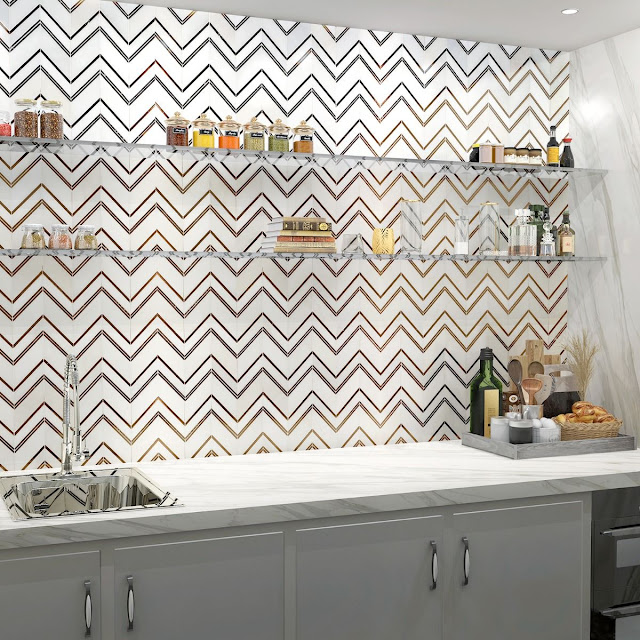
Over my 20+ years as an interior designer, I have had clients express a belief that patterns cannot be mixed. I have also had clients say they know patterns can be mixed but are mystified as to how to accomplish such a visual feat. I will say that pattern mixing is one of those magical interior design tools that can turn a pleasant room into an unforgettable one. When done well, it feels collected, layered, and effortless, as though the room simply evolved over time. But behind that seemingly casual charm is a bit of strategy, especially when you’re combining patterns across upholstery, rugs, pillows, and wallcoverings. The key is to create harmony, not chaos, and understanding how patterns speak to one another is where it all really begins.
While pattern mixing is more of an art than a science, there are a few guiding principles to acknowledge. I feel the secret to successful pattern mixing starts with scale. Think of your patterns the way you’d think of an orchestra: you need a strong, anchoring “soloist,” a medium-scale design to support it, and a smaller-scale pattern to fill in the details. For example, if your sofa fabric features a bold, oversized botanical or geometric, pair it with a rug that has a medium, more rhythmic pattern, and then bring in pillows with smaller-scale prints or textures that add depth without competing. This variation in scale creates a composition that feels dynamic but cohesive, allowing each pattern to breathe.
For this beautiful bedroom in an historic home, designer Corey Damen Jenkins combined three different patterns to great effect. There is a tight, botanical pattern over the bed, flanked by drapery panels in a medium-scaled trellis design (also used on a valance and pillows at the nearby window seat), but the scheme is punctuated with a large-scale blue and white zig zag seen on bed pillows and chair upholstery. Using three different scaled patterns works and they are unified with an analogous color scheme. Topping the room is a ticking striped wallcovering that actually ends up reading as a neutral--the rigid, consistent design complements the more active patterns below.
The example below uses up to five patterns and still manages to create a classic, traditional, tailored feeling. The wide stripes on the sofa harmonize with the much narrower stripes on the ottoman coffee tables. The ikat pattern on the adjacent chair works because of the scale and more random nature. The throw pillow on the sofa features a very tight, small-patterned Arabesque design. And finally, the drapes sport what looks to be a tone-on-tone damask which picks up the neutral carpet and end table cloth. The unifying factor is certainly the color scheme.
Color is the next guiding force, because it’s the thread that ties everything together. You don’t need to match perfectly—in fact, it’s often better if you don’t—but repeating certain hues across elements helps the eye connect the dots. A wallpaper with muted blues can echo in a woven rug, a stripe on an armchair, or a floral pillow. Even just a single shared tone—like a warm caramel, a soft blush, or a deep green—can make the whole room feel intentional. The trick is to rely on color families rather than identical shades, which keeps things feeling sophisticated instead of overly coordinated.
The warm hues in the image below make this library corner seem inviting and cozy. Three different patterns (are you seeing a "pattern" emerging?) engage the eye: a bold large patterned geometric pillow does not compete with an ikat chair that is nearly the same scale because of the movement in the pattern as well as the color. The beautiful background to these harmonized voices is a tight warm-toned paisley on the drapery.
When mixing patterns across various elements, it’s also helpful to vary pattern type. It's ok to blend geometrics with florals, stripes with abstract prints, or organic motifs with something more structured. This interplay keeps the look from feeling too themed or matchy. Wallcovering, especially, offers a beautiful opportunity to introduce a bold pattern that sets the stage. From there, upholstered pieces and pillows can echo motifs or colors without creating visual overload. And don’t forget texture—nubby linen, velvet, boucle, and embroidery all count as “patterns” in their own right and help soften the mix.
In the sitting arrangement below, we can see three prominent patterns. A large scale floral with plenty of background space looks great with a pair of striped square pillows and a single lumbar pillow in an ikat pattern, all in the same tones. But take a look at the ottomans in a blue color and how the subtle woven texture comes through. The rug is a woven sisal, another texture that can add a "pattern" to the room, and finally, the matchstick woven blinds add yet another organic texture.
In a sitting rom by designer Charlotte Lucas, our eye goes first to the blue velvet sofa so the room has a large neutral space for all the other patterns to play off of. A large scale botanical wallcovering sidles up to a pair of chairs in a smaller floral design in a neutral color. But look what she does with animal prints to enliven the scheme: leopard pillows and a zebra rug are the final zingy touches! This is some advanced pattern mixing, do not attempt this at home without the help of a professional...or you could hurt yourself, lol.
As I mentioned earlier, pattern mixing is more of an art than a science—it requires patience and curiosity, a willingness to experiment. We can start with a pattern you absolutely love and build from there, adjusting scale, color, and type as we go. There are many combinations that will fall into place and when it clicks, you will feel it. That’s the beauty of great design: it’s personal, playful, and always evolving. So if you'd like to explore the art of pattern mixing, I have access to a literal world of fabrics and materials...give me a call!
Happy designing!
Showing posts with label pattern. Show all posts
Monday, June 29, 2026
Monday, January 27, 2025
New Patterns From Porter Teleo
One of my favorite wallcovering companies, Porter Teleo (previously here) who make exquisite handmade and hand painted products, has several exciting new patterns to choose from!
Inspired by a walk in the South of France, AMITIÉ is a large scale botanical print that features branches adorned with abstracted blossoms of alpine rose, orange blossoms, and silver wattle. It comes in three colorways: Argent, Bleu, and Copper.
The sinuous forms of ECHO reference the wire sculptures of Ruth Asawa. Available in four colorways: Blush, Copper, Polished Bronze, and Zinc.
Representing human touch, botanical life, dreams, and the essence of artistic composition, the symbols of SIGNATURE reference the origins of Porter Teleo and the brand's core values of humanity, nature, and aesthetic individualism. In Cadmium, Creme, Noir, and Verdatre.
And finally, IN THE WILD is a striking, complicated pattern reminiscent of dynamic flowers, leaf-like abstractions, oversized shells, and curiously playful shapes which comes in Brown Umber, Cadmium Red, Graphite, and Ultramarine.
If you're interested in discovering these or any of the other beautiful Porter Teleo patterns, reach out to me so we can craft a magical, artistic environment together.
Happy designing!
Inspired by a walk in the South of France, AMITIÉ is a large scale botanical print that features branches adorned with abstracted blossoms of alpine rose, orange blossoms, and silver wattle. It comes in three colorways: Argent, Bleu, and Copper.
The sinuous forms of ECHO reference the wire sculptures of Ruth Asawa. Available in four colorways: Blush, Copper, Polished Bronze, and Zinc.
Representing human touch, botanical life, dreams, and the essence of artistic composition, the symbols of SIGNATURE reference the origins of Porter Teleo and the brand's core values of humanity, nature, and aesthetic individualism. In Cadmium, Creme, Noir, and Verdatre.
And finally, IN THE WILD is a striking, complicated pattern reminiscent of dynamic flowers, leaf-like abstractions, oversized shells, and curiously playful shapes which comes in Brown Umber, Cadmium Red, Graphite, and Ultramarine.
If you're interested in discovering these or any of the other beautiful Porter Teleo patterns, reach out to me so we can craft a magical, artistic environment together.
Happy designing!
Monday, February 26, 2024
New Patterns From Porter Teleo!
I have been enchanted by the glorious handmade, handpainted wallcoverings made by Porter Teleo for many years now. And they have introduced three new patterns that are just as gorgeous as their classics.
Emergence is a pattern of soft water lily leaves. Porter Teleo describes it: "This pattern draws inspiration from the profound symbolism of water lilies in Buddhism and Hinduism, where they represent spiritual rebirth. The large-scale botanical subjects highlight the fascinating structural beauty of lily pads that allows their leaves to float gracefully on water, presenting a unique blend of abstraction and mathematical precision."
In four colorways: Platinum, Argent, Lilac, and Charcoal.
Next is an origami-like pattern called Kimono. "The juxtaposition of the natural, mottled backgrounds and the bright, metallic linework creates a crisp, modern all-over pattern. This striking contrast pays homage to the meticulous craftsmanship of kimonos, celebrating the thoughtful selection of materials for their distinct qualities."
In four colorways: Copper, Gold, Pale, and Pewter.
I am most excited about Mariposa, inspired by the line work found on the wings of butterflies. "MARIPOSA’s muralistic composition is an exaggerated and zoomed-in interpretation of the beauty found all around us in nature." I am in love with the shapes of this one.
In four colorways: Argent, Bleu Pale, Mauve, and Verdatre.
If you love the exquisite products from Porter Teleo like I do, give me a call. I am sure we can find a wall for one of these beauties!
Happy designing!
Emergence is a pattern of soft water lily leaves. Porter Teleo describes it: "This pattern draws inspiration from the profound symbolism of water lilies in Buddhism and Hinduism, where they represent spiritual rebirth. The large-scale botanical subjects highlight the fascinating structural beauty of lily pads that allows their leaves to float gracefully on water, presenting a unique blend of abstraction and mathematical precision."
In four colorways: Platinum, Argent, Lilac, and Charcoal.
![]() |
| Emergence in Platinum installation |
![]() |
| Emergence in Platinum detail |
![]() |
| Emergence in Argent installation |
![]() |
| Emergence in Argent detail |
![]() |
| Emergence in Lilac installation |
![]() |
| Emergence in Lilac detail |
![]() |
| Emergence in Charcoal installation |
![]() |
| Emergence in Charcoal detail |
Next is an origami-like pattern called Kimono. "The juxtaposition of the natural, mottled backgrounds and the bright, metallic linework creates a crisp, modern all-over pattern. This striking contrast pays homage to the meticulous craftsmanship of kimonos, celebrating the thoughtful selection of materials for their distinct qualities."
In four colorways: Copper, Gold, Pale, and Pewter.
![]() |
| Kimono in Copper installation |
![]() |
| Kimono in Copper detail |
![]() |
| Kimono in Gold installation |
![]() |
| Kimono in Gold detail |
![]() |
| Kimono in Pale installation |
![]() |
| Kimono in Pale detail |
![]() |
| Kimono in Pewter installation |
![]() |
| Kimono in Pewter detail |
I am most excited about Mariposa, inspired by the line work found on the wings of butterflies. "MARIPOSA’s muralistic composition is an exaggerated and zoomed-in interpretation of the beauty found all around us in nature." I am in love with the shapes of this one.
In four colorways: Argent, Bleu Pale, Mauve, and Verdatre.
![]() |
| Mariposa in Argent installation |
![]() |
| Mariposa in Argent detail |
![]() |
| Mariposa in Bleu Pale installation |
![]() |
| Mariposa in Bleu Pale detail |
![]() |
| Mariposa in Mauve installation |
![]() |
| Mariposa in Mauve detail |
![]() |
| Mariposa in Verdatre installation |
![]() |
| Mariposa in Verdatre detail |
If you love the exquisite products from Porter Teleo like I do, give me a call. I am sure we can find a wall for one of these beauties!
Happy designing!
Monday, October 9, 2023
Sibling Patterns: Herringbone and Chevron
In the world of interiors, there can be so many names for so many different types of materials and patterns which can lead to confusion. A pair of patterns that, much like siblings who look alike, can be mistaken for one another are the herringbone and chevron. But there is one easy way to tell them apart.
Both patterns depend on strong diagonal lines. In the case of tile, shown in the photos below, or wood plank flooring, the planks or rectangular tiles will be placed at a diagonal. But it is how the ends are finished that determines which pattern it will be.
A herringbone pattern leaves the tile or plank as it is and simply lays them next to each other, without any cutting or adjustments. The staggered layout is reminiscent of a zipper's teeth...
By contrast, a chevron pattern is basically the same thing but with the ends cut at an angle so the join becomes a straight line instead of a staggered/overlapping intersection, like a herringbone.
Happy designing!
Both patterns depend on strong diagonal lines. In the case of tile, shown in the photos below, or wood plank flooring, the planks or rectangular tiles will be placed at a diagonal. But it is how the ends are finished that determines which pattern it will be.
A herringbone pattern leaves the tile or plank as it is and simply lays them next to each other, without any cutting or adjustments. The staggered layout is reminiscent of a zipper's teeth...
![]() |
| Herringbone floor in bathroom by Fiorito Interior Design |
By contrast, a chevron pattern is basically the same thing but with the ends cut at an angle so the join becomes a straight line instead of a staggered/overlapping intersection, like a herringbone.
Happy designing!
Subscribe to:
Posts (Atom)