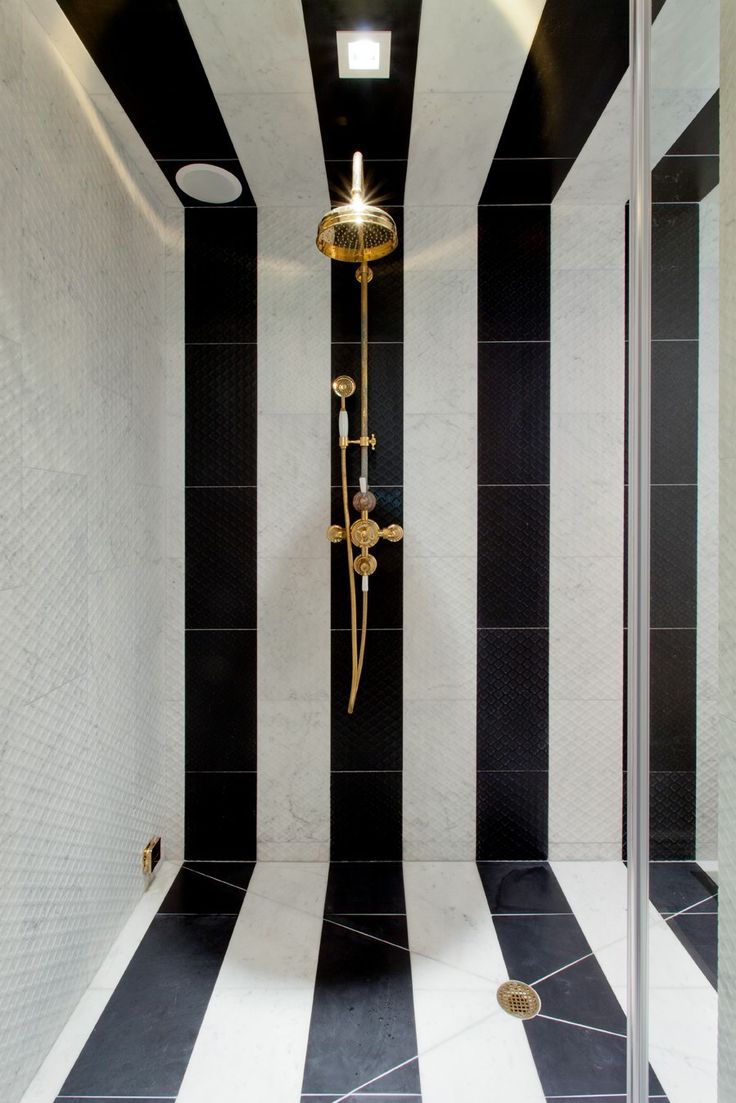
While pattern mixing is more of an art than a science, there are a few guiding principles to acknowledge. I feel the secret to successful pattern mixing starts with scale. Think of your patterns the way you’d think of an orchestra: you need a strong, anchoring “soloist,” a medium-scale design to support it, and a smaller-scale pattern to fill in the details. For example, if your sofa fabric features a bold, oversized botanical or geometric, pair it with a rug that has a medium, more rhythmic pattern, and then bring in pillows with smaller-scale prints or textures that add depth without competing. This variation in scale creates a composition that feels dynamic but cohesive, allowing each pattern to breathe.
For this beautiful bedroom in an historic home, designer Corey Damen Jenkins combined three different patterns to great effect. There is a tight, botanical pattern over the bed, flanked by drapery panels in a medium-scaled trellis design (also used on a valance and pillows at the nearby window seat), but the scheme is punctuated with a large-scale blue and white zig zag seen on bed pillows and chair upholstery. Using three different scaled patterns works and they are unified with an analogous color scheme. Topping the room is a ticking striped wallcovering that actually ends up reading as a neutral--the rigid, consistent design complements the more active patterns below.

The example below uses up to five patterns and still manages to create a classic, traditional, tailored feeling. The wide stripes on the sofa harmonize with the much narrower stripes on the ottoman coffee tables. The ikat pattern on the adjacent chair works because of the scale and more random nature. The throw pillow on the sofa features a very tight, small-patterned Arabesque design. And finally, the drapes sport what looks to be a tone-on-tone damask which picks up the neutral carpet and end table cloth. The unifying factor is certainly the color scheme.

Color is the next guiding force, because it’s the thread that ties everything together. You don’t need to match perfectly—in fact, it’s often better if you don’t—but repeating certain hues across elements helps the eye connect the dots. A wallpaper with muted blues can echo in a woven rug, a stripe on an armchair, or a floral pillow. Even just a single shared tone—like a warm caramel, a soft blush, or a deep green—can make the whole room feel intentional. The trick is to rely on color families rather than identical shades, which keeps things feeling sophisticated instead of overly coordinated.
The warm hues in the image below make this library corner seem inviting and cozy. Three different patterns (are you seeing a "pattern" emerging?) engage the eye: a bold large patterned geometric pillow does not compete with an ikat chair that is nearly the same scale because of the movement in the pattern as well as the color. The beautiful background to these harmonized voices is a tight warm-toned paisley on the drapery.

When mixing patterns across various elements, it’s also helpful to vary pattern type. It's ok to blend geometrics with florals, stripes with abstract prints, or organic motifs with something more structured. This interplay keeps the look from feeling too themed or matchy. Wallcovering, especially, offers a beautiful opportunity to introduce a bold pattern that sets the stage. From there, upholstered pieces and pillows can echo motifs or colors without creating visual overload. And don’t forget texture—nubby linen, velvet, boucle, and embroidery all count as “patterns” in their own right and help soften the mix.
In the sitting arrangement below, we can see three prominent patterns. A large scale floral with plenty of background space looks great with a pair of striped square pillows and a single lumbar pillow in an ikat pattern, all in the same tones. But take a look at the ottomans in a blue color and how the subtle woven texture comes through. The rug is a woven sisal, another texture that can add a "pattern" to the room, and finally, the matchstick woven blinds add yet another organic texture.

In a sitting rom by designer Charlotte Lucas, our eye goes first to the blue velvet sofa so the room has a large neutral space for all the other patterns to play off of. A large scale botanical wallcovering sidles up to a pair of chairs in a smaller floral design in a neutral color. But look what she does with animal prints to enliven the scheme: leopard pillows and a zebra rug are the final zingy touches! This is some advanced pattern mixing, do not attempt this at home without the help of a professional...or you could hurt yourself, lol.

As I mentioned earlier, pattern mixing is more of an art than a science—it requires patience and curiosity, a willingness to experiment. We can start with a pattern you absolutely love and build from there, adjusting scale, color, and type as we go. There are many combinations that will fall into place and when it clicks, you will feel it. That’s the beauty of great design: it’s personal, playful, and always evolving. So if you'd like to explore the art of pattern mixing, I have access to a literal world of fabrics and materials...give me a call!
Happy designing!