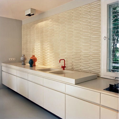
There is something comforting about the brightness and cleanliness of a white kitchen. The absence of color lends itself to a super-modern approach:
As we have discussed in past posts, modern elements can be set off by placing them in a traditional context, as seen in the kitchen below. Remember Design Mantra #1, at right: Contrast brings interest!
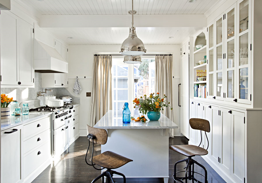
But of course white looks great in a more traditional setting as well.
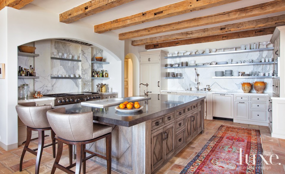
And if you want something with a little more kick than white but not as adventurous as black, an accent color like yellow or blue, or a natural texture like brick or wood goes a long way to adding some interest and life to a space.
This kitchen below has always fascinated me. I love how it feels more like a lounge or living room than a kitchen...a fact that is helped by the presence of a few beautiful table lamps!
Whether black, white, or in between on the color spectrum, there are wondrous kitchens out there, waiting to be born. Perhaps one is in your house this very moment. Give me a call...
Happy designing!


No comments:
Post a Comment