Monday, July 6, 2015

Mantel Inspiration

When it's not fireplace weather, and when your fireplace is not a source of heat and comfort, it is still the focal point (more often than not) of the room. And your fireplace mantel is a wonderful opportunity to infuse more interest via art, color, texture, and objects into your home. There are about as many ways to style a fireplace as there are fireplaces, so let these examples inspire you to curate your own collection of blossoms, art, and fun and meaningful objects.

A mantel can be an art gallery...


...or a place to express a favorite narrative. Here we see what must be some sort of homage to vaudeville and comedians! It is quirky, off-kilter, and fascinating! Create your own narrative: mountains?...Italy?...music? Your jumping off point could be anything.


A collection of Russian nesting dolls brings color to a black and white fireplace and mantel. The smoothness of the dolls contrasts well against the spiky antlers behind! Remember Design mantra #1..."Contrast brings interest!"


A ram's head and some ethnic objects--a hammered silver plate from India, a porcelain statue of Quan-Yin--lend a sense of world travel and exotica.


Fireplace breasts are traditional spots for mirrors. But why not go BIG with an enormous convex mirror? It bounces light around and serves to visually expand the room. Groupings of blossoms and branches below bring outside in.


I can't help but think that the following tableau is composed of articles and objects that are personal treasures of whomever created it. To replicate the look, scour antique stores, flea markets, and thrift stores for interesting objects like the metal watch faces, mercury candle stick holders, and old frames we see here. Keeping things in a single or limited color family helps unify your tableau. But be sure to include different textures, and include short, medium, and tall objects for variety and visual interest.


Brass accents on this mantel look wonderful against the black and white painting and photo (of one of David's hands from the Accademia in Florence!). Go ahead and layer your art...lean pieces up against other pieces.


If you have a Mid-Century Modern ranch house, embrace the time period with a mod piece of art, some blown glass bottles in an appropriate color, and a George Nelson wall clock!


This modern art work provides a textural backdrop for an antique framed piece (again, leaning against the larger painting), and lovely turquoise and celedon vases. The look is fresh for either spring or summer.


The ornate fireplace surround here calls for something more simple and sleek. Modern prints and etchings look fantastic next to the Georgian carving of the surround.


For maximum impact, group like objects together. This collection of artisanal vases looks great in a row. A white feathered Juju hat presides over it all. Notice how the height of the vases is arranged in an inverted pyramid. The dip in the center allows the Juju hat some space.


This tableau groups together black and white objects in a pleasing way. Plaster, glass, marble, paper, metal...


This arrangement in the home of interior designer Tommy Smythe uses the pyramid principle: larger anchor objects at either end, a tall piece of art work in the middle to form the peak, and intriguing curio objects fill the spaces in between.


Don't be afraid to try large pieces on your mantel. It might feel at first as if the objects are overwhelming your fireplace, but it's probably that you're simply not used to it. Be bold.


Notice how, in nearly every example above, the arrangement takes advantage of asymmetry. Many of the sculptures, vases, or art works are positioned on one side of the mantel. Play with this idea and see what you can come up with. And remember Design Mantra #5: "Odd numbers work best!" When in doubt, use three or five objects in groupings. It will instantly lend design cred to your tableau!

Happy designing!

Monday, June 29, 2015

History of Furniture: Biedermeier

After the fall of Napoleon in 1815, and before the European revolutions of 1848, there was a stylistic movement in art, literature, music, and design known as Biedermeier. Like any period in history, such elements of culture are always influenced by what is happening politically, and is usually a reaction to styles that directly preceded it. The pendulum loves to swing, and in this Biedermeier period, people surrounded themselves with an interior that was a version of the Napoleonic Empire style, which itself was a sort of toned down take on Louis XVI. But Biedermeier distilled things down even further, concentrating on making the Neo-Classical shapes and motifs into basic geometric shapes.

The Industrial Revolution helped to expand the growing middle class and suddenly, the masses had access to wealth and leisure time like they never had before. They wanted to have nicer homes, nice furniture, and nice objects to show off their new-found wealth. But they did not want to appear ostentatious. So we have stately pieces of furniture being made in humble local woods (since exotic woods coming into Germany were being heavily taxed) and especially veneers (often featuring a a beautiful bookmatched grain as seen in the last table in this post), Neo-Classical legs became simplified, and chair backs became scrolls carved out of the wood itself without any additional ornamentation. We see scroll arms on settees but again, they are almost cut out of a veneer and not really carved with any intricacy. We see Neo-Classical pillars as well but in a smaller scale on chests, desks, and armoires. Homes became more personal and comfortable--out of a necessity to withdraw from the public sphere, political turmoil and an oppressive, tight regime--with walls in pale hues or striped wallpaper, and objects of sentimental value like vases and decorative silver.


Because of its simplicity, Biedermeier furniture has an almost Art Deco quality to it that was certainly before its time. Yet the style is generally elegant with smaller, more delicate proportions. For this reason, Biedermeier furnishings can blend harmoniously with many other styles, from any of the Louis periods, the afore-mentioned Art Deco, to more contemporary styles. It would be a great foil with Mid-Century Modern, or even a 1980s Memphis piece (more on Memphis in an upcoming post...stay tuned!). Original Biedermeier pieces can be pricey, but are still available! If you find something at auction, chances are it will have been reupholstered since original fabric tended to be exotic silks stuffed with horse hair!

Happy designing!

Monday, June 22, 2015

Kelly Wearstler for Visual Comfort

All of us in the design world are pretty excited about the brand new lighting line design icon Kelly Wearstler has created for the extraordinary lighting company Visual Comfort. A collection of chandeliers, wall sconces, and table and floor lamps all feature Wearstler's signature flair for stark geometric shapes and interesting materials. Burnished brass, alabaster, ceramic, quartz crystal, silver leaf, and perforated metals suggest, as most of Wearstler's designs do, both a retro and contemporary sensibility. Current and future clients be forewarned: you should expect a Kelly Wearstler light in your future!


Cleo Desk Lamp

Cubist Chandeliers

Liaison Triple-tier Chandelier

Linden Table Lamps

Marmont Table Lamp in Burnt Gold and White Porous Ceramic

Melange Sconce

Melange Table Lamp

Precision Sconces

Halcyon Desk Lamp

Strada Flush-mount Light

Strada Sconce

Kelly Wearstler for Visual Comfort is available to the trade. If you like what you see, give me a call and we can scatter some gorgeous Wearstler lights around your house!

Happy designing!

Monday, June 15, 2015

Fiorito Interior Design Press Update, June 2015

For their June newsletter, the luxury bath fixture company Jason International interviewed me about a master bathroom project (previously here) in which I used a Jason tub. Read it here or click the photo below!


Thanks to the staff of Jason International. And thanks for a great product.

Happy designing!

Monday, June 8, 2015

Ten Basic Drapery Pleats

There's nothing like custom drapery to finish a space, to soften the bare hard edges of window casings, and to add extra color, pattern, and texture to a room. But there are so many ways to finish draperies, and so many options to consider. Of course some of these decisions will be driven by your individual style preferences and what kind of look we are trying to create. Below are ten basic ways to finish the top of a drapery panel; there are even more esoteric flourishes and variations on these ten, but for now, they will get us started.

1) Pinch Pleat
I think this is probably the one most all of us are familiar with. The classic pinch pleat is just that: the fabric is pinched together a few inches below the top and stitched together so the fabric falls in waves from each pinch. This style can come in two finger pleats (first image), classic three finger pleats (second image), all the way up to five finger pleats.


2) Euro Pinch Pleat
This style is also sometimes referred to as Parisian or French Pleats. Instead of the pinch being stitched a few inches down, it is stitched at the top. The result is similar to a classic Pinch Pleat but the waves fall from the very top. As you can see, there is also the option for two, three, or more pleats.


3) Pencil Pleat
Instead of fingers like in the previous pleat styles, these panels have continuous pleats all along the top of the panel.


4) Inverted Pleat
Imagine pleating a piece of fabric but facing out the reverse side. This creates a nice, structured, almost architectural drapery panel.


5) Goblet Pleat
This pleat style is so named because of its rsemblance to a drinking goblet. The rounded shape is achieved by inserting cardboard or tissue paper into the hollow for the goblet to keep its shape.


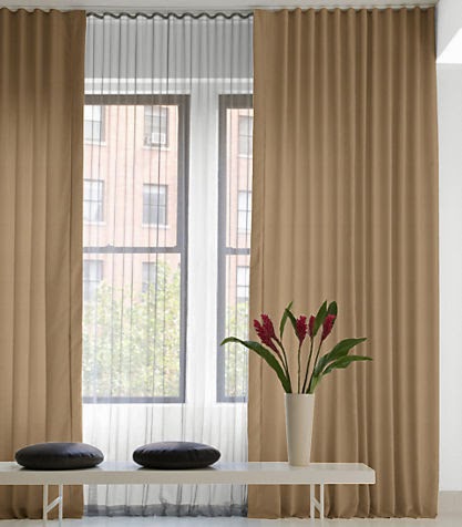
6) Ripplefold
Although the second pleat on this list is called the Euro Pinch Pleat, the Ripplefold is by far the more European styled drapery. Its clean lines are elegant, modern but timeless, and can go with any type of interior. It is quickly becoming the choice here in the States. Ripplefold panels installed on a hidden or flush track at the ceiling line are truly lovely (it makes a lower ceiling look taller) and I have done several sets for clients.


7) Grommet
This extremely casual style is rather rustic and useful in family rooms, game rooms, cabins or boat houses.


8) Rod Pocket
This style can be found on off-the-shelf drapery panels at retail stores and tends to look messy. Because the top of the panel is not truly finished, the fabric unfortunately does not hang uniformly.


9) Tab Top
Again, a very casual style good for breakfast rooms, garden rooms, or outdoor loges. The inherent trouble with a tab top though is the difficulty in pulling the panels open or closed since the fabric tends not to slide freely on the rod.


10) Tie Top
Possibly the most casual style of all, a tie top can look good in spaces that are emulating a kind of Bohemian/Parisian cafe look but just like a tab top, the panels do not slide freely.


Like I said at the start of this post, there are variations on what we see here, but these basic ten are used most in drapery fabrication.

If you have some bare windows or want a new look for your home, let's create some gorgeous custom window treatments made especially for you.

Happy designing!

Monday, June 1, 2015

Catch Your Balance: Symmetry vs. Asymmetry

One of the primary elements of design is symmetry...and by extension, its opposite, asymmetry. Symmetrical rooms are most often blessed with good bones: a central focal point such as a fireplace helps to balance a room and achieve a settled, classic, sometimes grand effect. These rooms are lucky enough to feature fireplaces centered on a wall, evenly spaced between windows.


A room doesn't have to have a fireplace to have a focal point. Generally speaking, the place where your eye falls first when one enters a room is the "focal point." This can be a wall, or a set of windows, or a single large window...

Here we see a wall large enough to accommodate a king size bed which is naturally the focal point of the room. Bedrooms are easy spaces in which to create symmetry since beds most usually have two night tables, a fact which lends itself to a pleasant layout.


This next living room has a similar presentation: the largest wall is nestled between sloping ceiling planes, focusing attention to the center. This space has created symmetry in that one can practically draw a line down the center, divide the space in half and come up with nearly the same pieces on each side.


Thankfully the windows in this rustic room below are balanced, leaving a generous space for some long format art in between. The art echoes the window shapes and creates even more balance for this lovely focal point.


This living room received a focal point from Scot Meacham Wood when he created a balanced arrangement highlighting shape and placement instead of the television which reads as another piece of this tableau.


Natural symmetry in a room feels stable and established, with an almost calming quality. But what of asymmetry? Well, it depends upon your approach. Asymmetry has been used for centuries in Japanese design which values negative space almost more than objects. I wrote about this in a previous History of Furniture post here and you can see this at work in the image below.


The alcove to the right is larger and cuts the wall roughly into a two-third/one third ratio (known as The Golden Mean) but somehow the space doesn't feel out of balance. This has to do with how expertly the negative space is handled: the smaller alcove has a raised platform and a black iron bell hung high which gives it more visual bulk, balancing out the larger space next to it. It is a visual trick that anyone can utilize to make asymmetrical spaces feel equal.

Let's take a look at a room that indeed has a central fireplace for a focal point but the room is weighted in the direction of the window. In order to fix this imbalance, pieces of a darker hue--an antique portrait in black and a dark wood chest--give weight to the "blank side" of the fireplace, achieving symmetry.


But what to do when a fireplace is not centered? This is so often the case and a good approach is to trick the eye, as we have seen. Below we see two versions of achieving balance with darker pieces (an armoire in the first image and a dark lamp and table in the second).


In the bedroom below, the pair of windows on the left could wreak havoc in any other room but the sparse platform bed evokes a Japanese, Zen-like feeling by weighting the other side of the windows with more night table bulk and a horizontal piece of art, again adding weight for balance. There is symmetry even in asymmetry!


Happy designing!