Regular readers know that I attend the San Francisco Decorator's Showcase every May and I always look forward to seeing what marvelous, inventive interiors my fellow designers have come up with. For last week's post, I wrote about the first floor of this year's showhouse. Soooo...where were we? Ah yes, we were about to walk up the stairs...
...to the second floor of this year's San Francisco Decorator's Showcase.
First up on this floor is the master bedroom by Jeff Schlarb which he calls Ten Thousand Dreams. Walls are clad in a navy blue fringe trim--the application of which must have taken a staggering amount of hours. A bed with a custom corner bench/ottoman--something I'd never seen before--anchored the room which was full of interesting art. A ceiling treatment of a material resembling cracked stone acts as a sort of canopy over the bed, but it follows across the room and down the opposite wall, a great detail. Various sculptures around the room add whimsy: a silver blob with legs served as a mirror for my selfie, and an enormous white plaster floor lamp that looks like a double ended palm tree lent a Dr. Seuss-ian flair.
Right off the master bedroom is an alluring master bathroom that really got me. What a masterful layering of materials and colors and textures by Adele Lapointe. Notice the repeated shape of the planters, the mirrors, and the frosted glass bucket pendant lights over the vanity. Matte Hunter Green Fireclay Tile subway tiles hung vertically in a soldier lay offer a verdant, organic element while a high contrast marble clads the shower and tub area.
But the feature I just loved was high impact but low effort--wooden privacy slats in front of the glass shower enclosure. And I also loved the low shower light installed on the wet wall to illuminate the flat shower pan with hidden channel drain. The same wooden slats were installed to create a water closet.
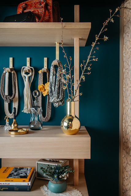
A "Vintage Modern Styling Room" just off the master bathroom by Gretchen Murdock was full of layered textural goodness. Used as a place to lay out clothing and accessories, and to prepare for the day, this room juxtaposes blackened wood on a wall and ceiling with three dimensional handmade terra cotta tiles on the opposite wall. At the rear of the room is a custom made airy wardrobe to serve as storage and hanging space. I was drawn to the peculiar semi-flush mount light, as well as the three dimensional tiles and the rug with a Native American design.
Melanie Coddington loves her some rosé wine...which inspired her feminine and wonderfully feminist Unapologetically Pink Rosé Lounge. The homage showed up in pink walls, a pink Milo Baughman sofa, pink wall hangings, and of course an enormous magnum of pink rosé wine. A pertinent and clever hand made art object, a purse announcing "TIME'S UP" sits on a plinth.
Just off the Unapologetically Pink Rosé Lounge was a little closet that was craftily and imaginatively outfitted by Sarah Bashford to be a DJ Getaway, complete with a cool circuit board wallcovering, analog and digital mixing decks, video capabilities and an amusing tumbling bookcase.
The idea of gender fluidity was the inspiration for Roberto Tiscareno's dark and sultry Androgino bathroom. The gender neutral space of black marble, black stone, and black plaster is fashionable for either female or male to express whomever they choose to be on a given day.
Because the Ocean Retreat Guest Bedroom is a space at the front of the house, just like the dining and living rooms below, with a window framing those spectacular views of the Marin Headlands and the Golden Gate Bridge, designer Eden Wright chose the tranquil, Zen-like qualities and blue and white color palette echoing the sea for her room which she envisioned as a spa-like sanctuary, a place to imagine and daydream.
A quick jog downstairs to the cooler temperatures of the "basement" leads past the In-House Wine Grotto by Lane McNab. She took a landing that could have been ignored and mulled it into an homage to Napa and the wine it produces. The wall in front of the space features hand made tiles by Forrest Middleton based on the patterns created by sound vibrations at play on thin sheets of sand.
I think of all the spaces in this year's Showcase, The Reading Room by Cynthia Spence and Elan Evans is one of my favorites. The space is deceptive at first, just seeming like a pleasantly appointed, yet shadowy room. But as I let my eyes linger on each surface, each texture, I was pulled in to the absolutely fascinating "Bohemian chic" melange that makes up this successful space. All walls and painted surfaces received treatment from Evans and Spence added layers of pattern and color in rugs and wallcoverings. The result is a room I did not want to leave...and for an interior designer who has been in a lot of rooms, that is really saying something.
The final space was by Jon de la Cruz who was responsible for the wildly successful kitchen at last year's Showcase, and which was subsequently named Kitchen of the Year by House Beautiful magazine. For this space, Jon chose to kit the long rectangular room out like a Bedouin tent. Called The Lady Cave, it is a place for the woman of the house to retreat to read, listen to music, binge watch Netflix...all while feeling cocooned, like when we used to build forts out of pillows and blankets when we were children.
Thanks to all the designers for sharing their vision and talent with us. It was another successful Designer Showcase. If you are in or near San Francisco, I urge you to attend next year. It's such a treat to be exposed to so much good design, color, texture, and pattern all at once.
Happy designing!


No comments:
Post a Comment