I am eagerly awaiting the opening of the San Francisco Decorator's Showcase in a few weeks--and regular readers know I always post photos--but in the meantime, here are some images of the second annual Wattles Mansion Showcase House in Los Angeles, which was just held in the historic Wattles Mansion.
The website of the production company responsible for the Showcase says:
About Wattles Mansion:
This year the City of Los Angeles will allow a Designer Showcase to be presented in one of the historic homes owned by the city. Wattles Mansion, a 1908 Mission Revival built by the firm of Myron Hunt and Elmer Grey (Rose Bowl, Huntington Library & Ambassador Hotel). The house has been recognized as “the only remaining intact example of the once plentiful Hollywood estates from the period preceding the film industry”. Gurdon Wattles, originally from Omaha Nebraska, was responsible for bankrolling much of early Hollywood and the movie studios.
About the showcase:
In the spring of 2017 (March 24th-April 16th), REITZHAUS will team with acclaimed interior designers for this event for the second year. The theme for the showcase, ‘Historic Hollywood; The New Classics’. We look to this historic Los Angeles home and how it would be deigned and lived in today, while keeping all of the homes original historic features. This creative process will be a unique endeavor. Wattles Mansion and Gardens benefits from this event with restoration and donations provided by talented designers.
And the designers lived up to the brief with interesting, eclectic, and modern furnishings and finishes in this historic home.
Designer David Dalton created a marvelous, welcoming entry to the mansion. This foyer sets a tone both modern and antique, befitting the stature of the building.
Because it is an historic site, the original kitchen in the mansion cannot be removed and renovated, but a design team from Williams-Sonoma Home gave the kitchen and butler's pantry a funky, cool modern edge with dark grey paint and interesting accessories that support the original era of the house.
Here is a BEFORE image of the lilving room. Clearly the spacious room has good bones. But the design duo of Woodson and Rummerfield got a hold of it...
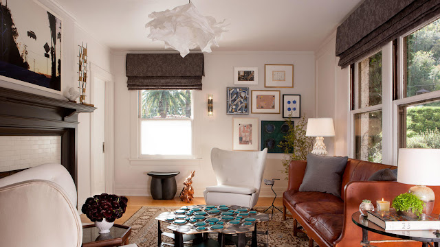
...and hung art salon-style (including a large painting, center, of Norman Talmadge that was found deep in the basement of the house!), and furnished the room with pieces that evoke different times and locales. It feels collected and curated over time which is the goal of good interior design!
This BEFORE picture of the dinign room shows elements typical to a Mission Revival home like the coffered ceiling and the Arts and Crafts lighting.
But Patrick Dragonette lined the walls with purple velvet, and added modern art and a stunning chandelier to create a sultry, sexy dining room perfect for dinner parties by candle light.
Fernando Diaz showed great respect for the library by keeping the walnut paneling and bookcases as well as the original ceiling painting intact. His choice of furniture--and lighting fixture!--is a fitting compliment to the room.
The large second floor landing is a luxurious spot to sit thanks to designer Jessica Brende.
Nicole Gordon added lots of art, not only on the walls but also in the form of art pieces like the Chuck Moffit coffee table to this light and airy sitting room.
The Jonathan Winslow and Fariba Cohen-designed game room feels casual and inviting.
Connecting the game room and sitting room is a gorgeous bar area created by Nicole Gordon (who also did the sitting room). I love the wallpaper she used (Tiger and Magpie by Krane) and the ethnic, dramatic feel of the entire space. The doors on the casework are lovely and the best part is the carved wooden jungle cat console table under the window!
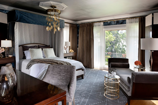
The master bedroom by Kym Rodger is particularly stunning. I adore how all the eclectic elements come together in a surprising way to create a truly unique feel and vision.
The Ladies' Lounge by Kelley Jackson brings an expected feminine color, pink, together with the Mission style of the home... and it works!
For every Ladie's Lounge, there must a Gentleman's Lounge, and this one designed by Mae Brunken and Melinda Ritz is pretty cool. The retro elements are superb--I love the Art Deco blue glass mirror--especially the neon "Haircuts and Shaves" sign! It feels like an old fashioned apothecary or barber shop.
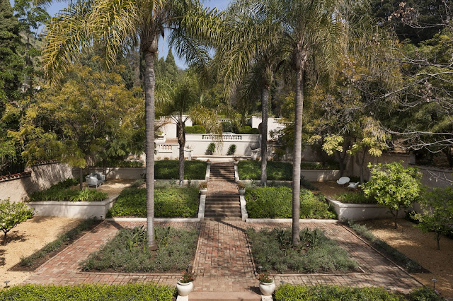
And the grounds got some sprucing up with a new landscape design by Anna Hoffman.
You can learn more about Wattles Mansion here. For information about visiting or renting Wattles Mansion, click here.
If you are in the Los Angeles area next year, keep an eye out for a possible third annual Wattles Mansion Showcase by visiting this site.
And stand by for coverage of the San Francisco Decorator's Showcase, coming soon.
In the meantime happy designing!


No comments:
Post a Comment