Welcome to 2014 everyone! We survived and are still here to see another year... and good for us!
A New Year always brings with it the idea of beginnings, new ventures, and fresh starts, even if it is a culturally imposed idea. However artificial, it is an exciting concept to be able to wipe the slate clean and prepare for something completely new.
With this in mind, I give to you my thoughts about nurseries and baby rooms: one of the great interior design dilemmas. Now, I am aware that parents who are expecting are caught up in a whirl of excitement. They are entering into unknown territory and preparing for a lot of change in their lives. So perhaps that is why many parents fall back on tired, expected, clichéd nursery design ideas. I also know that parents are excited to be expecting a boy or a girl (if they choose to discover such information ahead of time) but when I see a pink "girl-themed"/ princess nursery or a blue "boy-themed"/ cowboy-nautical-truck nursery, I feel it is a missed opportunity: a nursery can be as eclectic, stylish, interesting, and dramatic as any other room in the house.
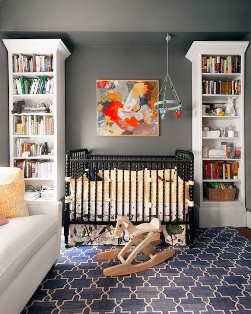
Take for example, this lovely and very sophisticated nursery by Erin Gates. Classic and stylish elements are set off against fantastic warm gray walls. And the painting is a beautiful addition of color and form.
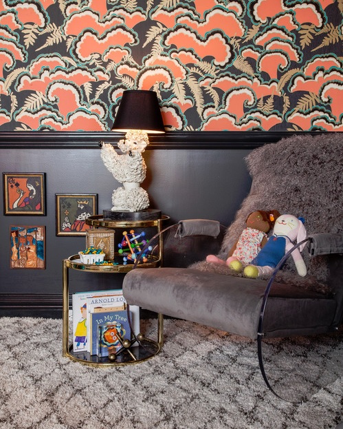
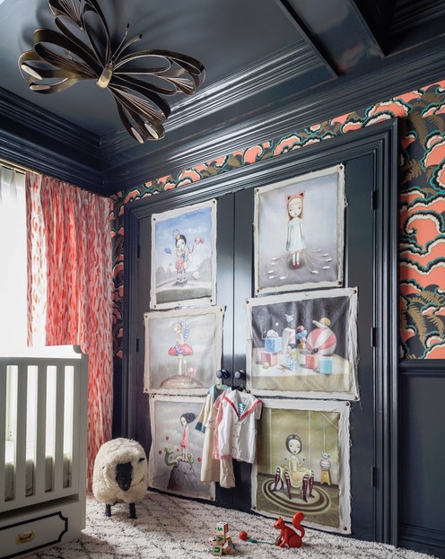
Now, this spectacular nursery by the equally spectacular Tamara Kaye Honey features a slate and coral palette within a Hollywood Regency style. The wallpaper is amazing, and the brass butterfly on the ceiling and the spooky-cool paintings tacked to the closet door make the space.
Designer Summer Thornton used Scalamandré's legendary zebra-print wallpaper in this eclectic nursery that blends vintage, Hollywood Regency, and whimsical as well as ethnic elements into a tantalizing, pleasing mix.
This bright, inviting nursery by Lucas Studio is more like a lovely guest room. The color palette and pattern-mixing are superb, lending a sun room or garden room feel.
Lovejoy Designs created a fresh, clean nursery in pale celadon and persimmon. Light and refined. The orange is a perfect counterpoint to the serenity of the celadon and adds a spark of life.
A nursery does not have to be Disneyland or an imposed gender statement. Use your imagination... don't fall back on common, stereotypical "baby" rooms. There are and should be no limits. You can even put a photo mural on a nursery wall of a Slilm Aaron's Palm Springs image, shown below, and make your baby's early years into a fabulous mid-century, jet-set adventure!
http://eringatesdesign.com/
http://houseofhoney.la/
http://www.summerthorntondesign.com/
http://www.harbingerla.com/
http://www.lovejoydesigns.net/
So if you or someone you know have cause to create a nursery, congratulations! Second, think outside the nursery room box when creating a space for the new tenant! Let your imagination roam and happy designing!


No comments:
Post a Comment