I wish all of my readers and followers in the United States a very happy Thanksgiving Day!
"Acknowledging the good that you already have in your life is the foundation for all abundance."
― Eckhart Tolle
Monday, November 20, 2023
Monday, November 6, 2023
Famous Homes: Frank Lloyd Wright's Hollyhock House
Legendary architect Frank Lloyd Wright is known for his unique and revolutionary design style as well as his designs for furniture, decorative objects, and intricate stained glass windows that went inside his structures. We looked at an iconic FLW house in Los Angeles called the Ennis House, previously here. But there is another FLW house in LA that is equally famous and revolutionary.
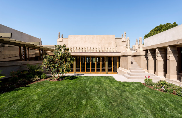
The Hollyhock House was built for oil heiress Aline Barnsdall between 1919 and 1921, and predates the Ennis House by a couple of years, serving as a sort of dry run for the extravagant elements seen adorning the Ennis House. Barnsdall had acquired 36 acres of land called Olive Hill and hired Wright to build an arts complex with a theater, cinema, commercial shops and artist residences that would cover much of the property. However, only the Hollyhock House was completed.
Wright and Barnsdall had a difficult working relationship, exacerbated by the fact that during construction on her home, he was mostly in Japan overseeing the construction of his famed Imperial Hotel in Tokyo. He delegated much of the daily work to an assistant, Rudolph Schindler, and to his son Frank Lloyd Wright Jr. The design itself is a U shape around a central courtyard. He envisioned the entire structure as a Mayan Revival building, the same style of the Imperial Hotel and the Ennis House. In fact, the walls are titled at 85 degrees giving the appearance of a Mayan near-pyramid temple.
Barnsdall's favorite flower was the hollyhock and FLW used stylized and abstracted designs of the stalks on the exterior, much the way he used stamped concrete tiles at the Ennis House.
The abstracted concrete hollyhock can be seen along the top of the building in a frieze, creating an almost crenellated effect, as well as in finials at the stairs to the rooftop terraces.
The interior of the home is beautifully laid out with levels, steps, and halls and loggias connecting smaller private spaces...creating a feeling of openness yet at the same time of intimacy. Below we can see a view from the entry and the dining room off to the left. Wright designed the octagonal dining table and high-backed chairs with LA furniture manufacturer Baker Brothers.
The stunning centerpiece of the living room is the fireplace, a soaring monument with a bas relief of geometric forms and more abstracted hollyhocks. The ceiling over it features a stained glass "skylight" set in a slatted wood frame. Interestingly, the original construction of the fireplace included a moat that was to be filled with water that came from the fountain outside, and recirculated back. The idea of contrasting fire and water was a poetic one but the mechanics of it all proved to be too complicated. In the 1965 photo below it looks as if the moat around the hearth had been filled in, but the current iteration of the fireplace shows the moat has been returned, albeit empty.
Wright also pioneered a bold feature of architecture: corners of mitered glass, shown here on the Sun Room.
Like so many of FLW's structures, the Hollyhock House has had tremendous structural problems. It has been plagued with copious leakage, sagging concrete beams, rain water issues on the flat roofs, earthquake damage to unreinforced sections of cantilevered concrete, and cracks in the pool. However, starting in 2008 a deep restoration took place, and Hollyhock house opened again to the public in 2015 with all issues resolved. You can take a self-guided tour of Hollyhock House by visiting their site for information. If you can't get to Los Angeles, there is a marvelous virtual tour here.
Happy designing!
The Hollyhock House was built for oil heiress Aline Barnsdall between 1919 and 1921, and predates the Ennis House by a couple of years, serving as a sort of dry run for the extravagant elements seen adorning the Ennis House. Barnsdall had acquired 36 acres of land called Olive Hill and hired Wright to build an arts complex with a theater, cinema, commercial shops and artist residences that would cover much of the property. However, only the Hollyhock House was completed.
![]() |
| Hollyhock House - Photo by Joshua White |
Wright and Barnsdall had a difficult working relationship, exacerbated by the fact that during construction on her home, he was mostly in Japan overseeing the construction of his famed Imperial Hotel in Tokyo. He delegated much of the daily work to an assistant, Rudolph Schindler, and to his son Frank Lloyd Wright Jr. The design itself is a U shape around a central courtyard. He envisioned the entire structure as a Mayan Revival building, the same style of the Imperial Hotel and the Ennis House. In fact, the walls are titled at 85 degrees giving the appearance of a Mayan near-pyramid temple.
![]() |
| Exterior of Hollyhock House in 1921 - Photo by Julius Schulman |
![]() |
| Exterior of Hollyhock House in 1921 - Photo by Julius Schulman |
Barnsdall's favorite flower was the hollyhock and FLW used stylized and abstracted designs of the stalks on the exterior, much the way he used stamped concrete tiles at the Ennis House.
![]() |
| Abstracted hollyhock stalks - Photo by Joshua White |
![]() |
| Photo by Joshua White |
![]() |
| Photo by Joshua White |
![]() |
| Photo by Joshua White |
The interior of the home is beautifully laid out with levels, steps, and halls and loggias connecting smaller private spaces...creating a feeling of openness yet at the same time of intimacy. Below we can see a view from the entry and the dining room off to the left. Wright designed the octagonal dining table and high-backed chairs with LA furniture manufacturer Baker Brothers.
The stunning centerpiece of the living room is the fireplace, a soaring monument with a bas relief of geometric forms and more abstracted hollyhocks. The ceiling over it features a stained glass "skylight" set in a slatted wood frame. Interestingly, the original construction of the fireplace included a moat that was to be filled with water that came from the fountain outside, and recirculated back. The idea of contrasting fire and water was a poetic one but the mechanics of it all proved to be too complicated. In the 1965 photo below it looks as if the moat around the hearth had been filled in, but the current iteration of the fireplace shows the moat has been returned, albeit empty.
![]() |
| Hollyhock House living room in 1965 - Photo by Marvin Rand |
![]() |
| Hollyhock House living room as it is today - Photo by Joshua White |
Like so many of FLW's structures, the Hollyhock House has had tremendous structural problems. It has been plagued with copious leakage, sagging concrete beams, rain water issues on the flat roofs, earthquake damage to unreinforced sections of cantilevered concrete, and cracks in the pool. However, starting in 2008 a deep restoration took place, and Hollyhock house opened again to the public in 2015 with all issues resolved. You can take a self-guided tour of Hollyhock House by visiting their site for information. If you can't get to Los Angeles, there is a marvelous virtual tour here.
Happy designing!
Monday, October 23, 2023
Happy Halloween 2023!
Happy Halloween to all my clients, subscribers, and regular readers! Here's a bit of inspiration for your spooky decorating urges...it's not too late to conjure up some atmosphere!
I hang cut up black trash bags in a fringe, as shown here. I also have a giant spider I hang from the eaves of my front porch. Colored lights go along way to conjuring up a mood of unease...use green tinted lights for a sickly tint. And ghosts cut out from translucent tracing paper taped to windows offer a chill.
You can use old frames from a thrift store painted black and glue on peat moss and twigs; tie branches and ripped cheesecloth to a chandelier; place a realistic looking skull on a pile of old books; drip red wax on white taper candles to make them "bleed."
Happy Halloween!
I hang cut up black trash bags in a fringe, as shown here. I also have a giant spider I hang from the eaves of my front porch. Colored lights go along way to conjuring up a mood of unease...use green tinted lights for a sickly tint. And ghosts cut out from translucent tracing paper taped to windows offer a chill.
Happy Halloween!
Monday, October 9, 2023
Sibling Patterns: Herringbone and Chevron
In the world of interiors, there can be so many names for so many different types of materials and patterns which can lead to confusion. A pair of patterns that, much like siblings who look alike, can be mistaken for one another are the herringbone and chevron. But there is one easy way to tell them apart.
Both patterns depend on strong diagonal lines. In the case of tile, shown in the photos below, or wood plank flooring, the planks or rectangular tiles will be placed at a diagonal. But it is how the ends are finished that determines which pattern it will be.
A herringbone pattern leaves the tile or plank as it is and simply lays them next to each other, without any cutting or adjustments. The staggered layout is reminiscent of a zipper's teeth...
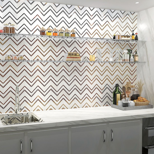
By contrast, a chevron pattern is basically the same thing but with the ends cut at an angle so the join becomes a straight line instead of a staggered/overlapping intersection, like a herringbone.
Happy designing!
Both patterns depend on strong diagonal lines. In the case of tile, shown in the photos below, or wood plank flooring, the planks or rectangular tiles will be placed at a diagonal. But it is how the ends are finished that determines which pattern it will be.
A herringbone pattern leaves the tile or plank as it is and simply lays them next to each other, without any cutting or adjustments. The staggered layout is reminiscent of a zipper's teeth...
![]() |
| Herringbone floor in bathroom by Fiorito Interior Design |
By contrast, a chevron pattern is basically the same thing but with the ends cut at an angle so the join becomes a straight line instead of a staggered/overlapping intersection, like a herringbone.
Happy designing!
Monday, September 25, 2023
A Refined Rustic Kitchen by Fiorito Interior Design
The request from my client for this kitchen remodel was to imbue the room with a rustic farmhouse feeling, but without the usual tropes or kitsch. What resulted is a beautiful mix of refined and rural. To begin, we laid down a stunning silver travertine floor in a Versailles pattern and used the color palette to inform the rest of the space. The bleached silvery wood of the island and the cream cabinetry compliment the flooring. Of course the stainless steel appliances continue the palette, as do the porcelain backsplash tiles made to look like aged, worn bricks. The deep bowl farmhouse sink and faucet that looks like it is from a bygone era give the kitchen a sense of permanence and a connection to the past without veering into theme-park design.
If you're thinking of remodeling your kitchen, I'd love to hear from you. Just click on my logo to the right for my contact info. Let's talk about your wish list and see what we can do!
Happy designing!
![]() |
| Photo by Bernardo Grijalva |
![]() |
| Photo by Bernardo Grijalva |
![]() |
| Photo by Bernardo Grijalva |
If you're thinking of remodeling your kitchen, I'd love to hear from you. Just click on my logo to the right for my contact info. Let's talk about your wish list and see what we can do!
Happy designing!
Monday, August 28, 2023
Three Cabinetry Door Styles To Know
When I am designing a kitchen or bathroom for a client, they are usually surprised at how many decisions are involved, sometimes small ones they never dreamed of. So many details are hiding around every bend in the remodel road, and one of the things that most people have never had to notice or think about is the style of cabinetry they want. Sure, people know they want something simple and modern, or something ornate and traditional. But there is a level beyond that we always need to explore.
The most popular door and drawer styles now are called "inset" and "full overlay."
An inset door and drawer is one that is, as the name suggests, inset into the frame of the cabinet. The front of the door or drawer is flush with the face of the cabinet, as you can see below in a recent kitchen I did for a client (previously here). The result is a sleeker, cleaner look even while using traditional Shaker doors as illustrated here.
This inset style is currently very popular, but every now and then I hear feedback from a client who thinks the look seems a little busy. They don't like being able to see not only the lines around the door or drawer but then also the face which they perceive as making more visual lines. In this case, I recommend the full overlay door style. This is where all the doors and drawers meet, so one cannot see the face frame of the cabinet at all. This style looks great with more modern slab front doors and drawers. I designed two bathrooms, seen below, that show this off beautifully.
The warm wood of the Walk In The Forest bathroom, previously here, adds a beautifully organic feeling to the minimalist slab doors and drawers, allowing the horizontal wood grain to become the feature. The full overlay doors and drawers here make the vanity feel neat and composed.
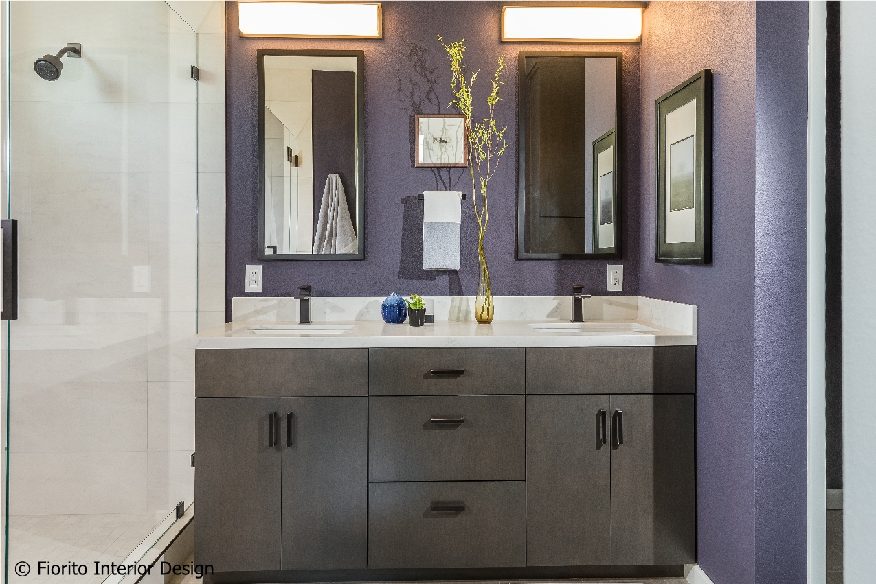
The next bathroom, which I called Dramatic (see it here) because of the deep plum wall, features a vanity with full overlay doors and drawers.
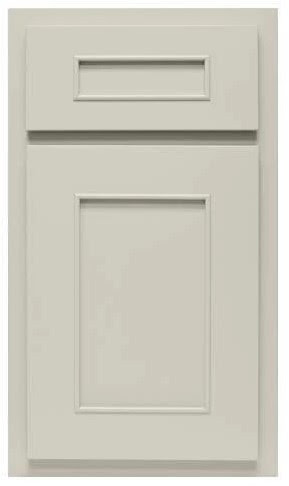
But you don't have to use slab doors to achieve a nice effect with full overlay doors. A more traditional door profile, as seen below in the Light and Airy Kitchen, here, I designed for some clients, shows this off nicely. A Shaker door modified with a slender bead looks wonderful in this configuration.
The third option is one that most people now avoid because it gives your newly remodeled space a dated appearance. The "standard" or "partial overlay" is one where the doors and drawers are neither inset into the cabinet box nor do they meet to hide the face of the box...they are just small enough to allow about a half inch of the frame to be seen. This is called the "reveal" and to my eye is not only dated but also has the look of a piece of cabinetry from a big box store...and such pieces tend to be poorly made. Not to put too fine a point on it, but standard or partial overlay doors and drawers make the piece of cabinetry look like the least expensive thing a landlord could buy to put into a rental unit. If you stick with full overlay or inset doors and drawers, you will have a space that looks well designed.
Happy designing!
The most popular door and drawer styles now are called "inset" and "full overlay."
An inset door and drawer is one that is, as the name suggests, inset into the frame of the cabinet. The front of the door or drawer is flush with the face of the cabinet, as you can see below in a recent kitchen I did for a client (previously here). The result is a sleeker, cleaner look even while using traditional Shaker doors as illustrated here.
![]() |
| Photo by Rick Pharoah |
![]() |
| Photo by Rick Pharoah |
![]() |
| Photo by Rick Pharoah |
![]() |
| Photo by Rick Pharoah |
This inset style is currently very popular, but every now and then I hear feedback from a client who thinks the look seems a little busy. They don't like being able to see not only the lines around the door or drawer but then also the face which they perceive as making more visual lines. In this case, I recommend the full overlay door style. This is where all the doors and drawers meet, so one cannot see the face frame of the cabinet at all. This style looks great with more modern slab front doors and drawers. I designed two bathrooms, seen below, that show this off beautifully.
The warm wood of the Walk In The Forest bathroom, previously here, adds a beautifully organic feeling to the minimalist slab doors and drawers, allowing the horizontal wood grain to become the feature. The full overlay doors and drawers here make the vanity feel neat and composed.
![]() |
| Photo by Genia Barnes |
![]() |
| Photo by Genia Barnes |
![]() |
| Photo by Genia Barnes |
The next bathroom, which I called Dramatic (see it here) because of the deep plum wall, features a vanity with full overlay doors and drawers.
![]() |
| Photo by Bernardo Grijalva |
![]() |
| Photo by Bernardo Grijalva |
![]() |
| Photo by Bernardo Grijalva |
But you don't have to use slab doors to achieve a nice effect with full overlay doors. A more traditional door profile, as seen below in the Light and Airy Kitchen, here, I designed for some clients, shows this off nicely. A Shaker door modified with a slender bead looks wonderful in this configuration.
![]() |
| Photo by Bernardo Grijalva |
![]() |
| Photo by Bernardo Grijalva |
![]() |
| Photo by Bernardo Grijalva |
The third option is one that most people now avoid because it gives your newly remodeled space a dated appearance. The "standard" or "partial overlay" is one where the doors and drawers are neither inset into the cabinet box nor do they meet to hide the face of the box...they are just small enough to allow about a half inch of the frame to be seen. This is called the "reveal" and to my eye is not only dated but also has the look of a piece of cabinetry from a big box store...and such pieces tend to be poorly made. Not to put too fine a point on it, but standard or partial overlay doors and drawers make the piece of cabinetry look like the least expensive thing a landlord could buy to put into a rental unit. If you stick with full overlay or inset doors and drawers, you will have a space that looks well designed.
Happy designing!
Labels:
bathroom,
cabinetry,
contemporary,
door,
drawer,
Fiorito Interior Design,
full overlay,
inset,
Jeff Fiorito,
kitchen,
modern,
partial overlay,
Shaker door,
slab door,
standard overlay,
transitional
Subscribe to:
Posts (Atom)