Monday, February 28, 2022

History of Furniture: The Conversation Pit

For this installment, let's look at something that is not so much an actual piece of individual furniture as much as it is a structure: The Conversation Pit.

Although sunken seating has roots far back in history, particularly in Asian countries, interior design lore suggests that the first real conversation pit as we know it today was created by Bruce Goff, an American architect, for a home he designed in 1927. Conversation pits became something of a signature in his home designs but it wasn't until the 1950s that the idea caught fire and spread, showing up in the 60s, 70s, even into the 80s!

Perhaps one of the best known examples of a conversation pit is in the Miller House, the mid-century masterpiece designed by Eero Saarinen with interiors by the incomparable Alexander Girard. It was Girard who suggested the conversation pit so as not to clutter the space with furniture pieces that would have impeded the view and interrupted the lines of Saarinen's architecture.


Another spectacular example of a conversation pit, on a grand scale, is another Saarinen design: the TWA Terminal at JFK which is now the fabulously retro TWA Hotel!


Conversation pits could be found in ordinary residential designs as well!


Eventually, like any element from pretty much any era, conversation pits started to look dated and fell out of favor. But word is they are making a comeback in interior architecture and design. Here is a current, superb example by architect Craig Steely who embedded a marvelous sunken pit into the concrete foundation of a home in the hills of the Santa Cruz Mountains. Steely says the pit "is filled with 144 sq. ft. of B&B Italia’s 'Tufty time' sofa components." In deep purple. Delightful.


Happy designing!

Monday, February 14, 2022

A Salute To Bedrooms... For Valentine's Day 2022

Since today is Valentine's Day, I thought I would re-share a popular post from the past: a salute to sensuality featuring some luxurious, fun, luscious boudoirs.

One of the most basic ways to create an inviting bedroom retreat is to simply make the bed itself seem inviting. A padded and tufted headboard, as seen in the two photos below, sets the stage for a bed that appears sprawling, substantial...a comfortable place to spread out, a tranquil spot to relax on, a soft sensuous spot to roll around in...

A bed with an attractive base and headboard signals a sense of place and purpose.
In the first photo, the bed seems like a cushy cloud nestled on a plinth of warm, rich leather. Second image: the soft blue headboard and footboard by Jay Jeffers announces itself in this superbly relaxed yet sophisticated room.

http://jeffersdesigngroup.com/

Layering soft, sumptuous textures is another way to add a decadent sense to a bedroom. In the tactile room below, designed by Eric Kuster, we see hair-on-hide panels on the anchor wall, and a soft faux fur throw plays well with velvets and satins.

http://www.erickuster.com/

Speaking of fabrics, another way to soften a bedroom is to use fabric panels on the walls, a technique I have successfully used for clients. You can use drapery panels as a floor-to-ceiling headboard, like the first image. Or you can run panels along an entire wall, like Elizabeth Gordon did in the second image below. It's also good for dampening sound (wink wink).

http://www.elizabeth-gordon.com/

A dark color palette in a bedroom says moody, exotic, and romantic.
The first image below by designer Smith Boyd features a delicious palette of browns, taupes, and greys along with textures like leather. The wood-grain striped wallpaper creates a natural, slightly wilder feeling that is tipped a little to the masculine side. The feeling of the dark purple Arabesque wallpaper in the next image is carried through by the Rococo mirrors and night tables... it feels like a fantasia on Mozart's "Abduction From The Seraglio!"

http://smithboydinteriors.com/

And think about dramatic, steamy, over-sized photos for an addition of extra sass and whimsy.
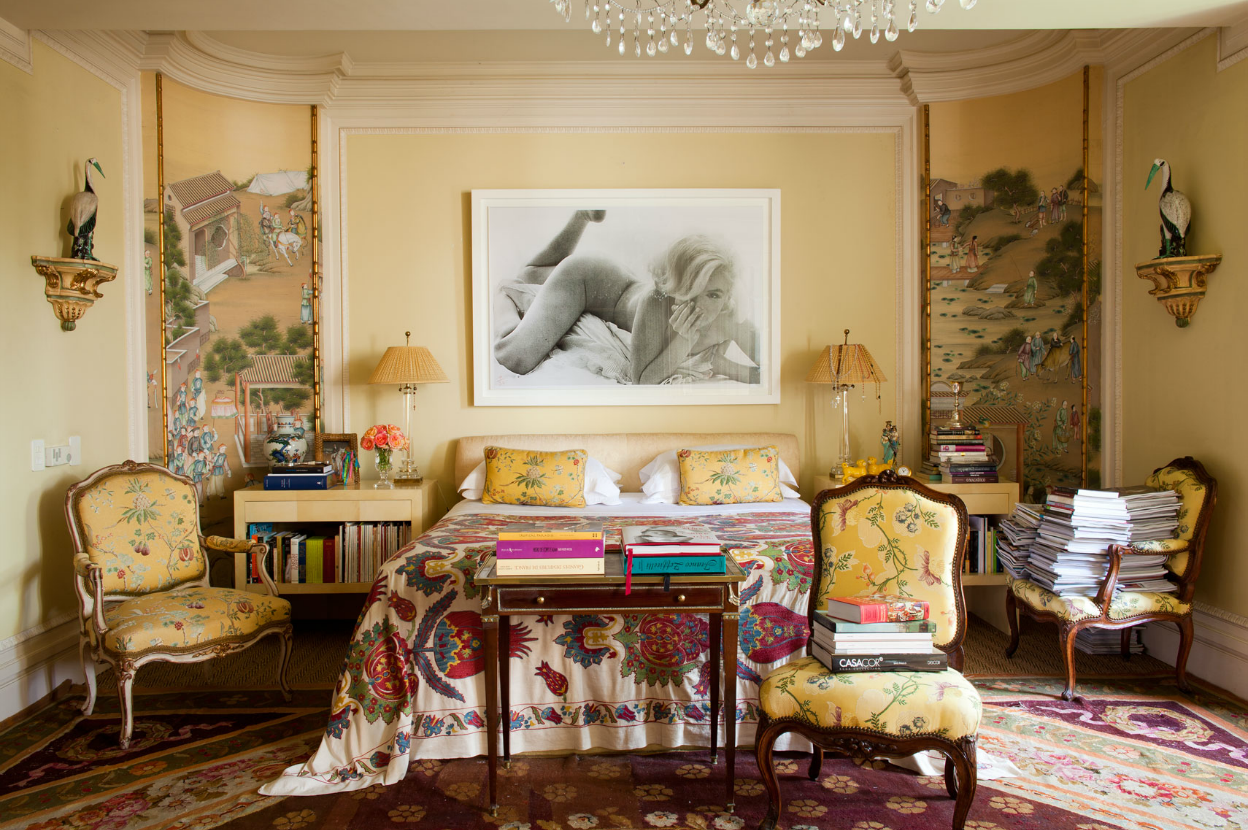
In the first photo, Amanda Nisbet's wild room for the Kip's Bay Showhouse uses a photo of pink glossed lips by Marilyn Minter. Another Marilyn, this one Monroe, presides over the bedroom of Brazilian architect Jorge Elias and his wife Lucila in the second image. I love how the lightness, curves, and playfulness of the photo (and its subject) contrast with as well as compliment the Chinoiserie feel.

And finally, I must report that I have tried to give equal time but I can't find an image of a bedroom that uses sexy images of men, which seems a little unlikely... there have to be some expertly designed bedrooms out there with a painting of a male torso or even a stylized Tom of Finland image. If any of my readers come across such a thing, let me know!

http://amandanisbetdesign.com/
Above photo by Trevor Tondro

http://www.jorgeelias.com.br/
Above photo by Roger Davies

And notice how, in all of these images, extra pillows offer more visual comfort as well as more opportunities to introduce color, texture, and pattern. I hope I have inspired you to think about ways to enhance your bedroom, and to make it even more of a special "destination."

Happy Valentine's Day and happy designing!

Monday, January 31, 2022

Porcelain Tiles Mimic Shou Sugi Ban

Italian tile manufacturer Casalgrande Padana have created a wonderful porcelain plank tile that mimics the look of the centuries-old Japanese technique of Shou Sugi Ban, which means burnt cedar beam in Japanese. Originating in the 1700s, the method where cedar planks are charred and then sealed with natural oils, making them a unique material for building, is also known as Yakisugi.

 
 And Casalgranda Padana captures the rusticity and marvelous darkened wood grain in a porcelain tile. Available in 9mm thickness, the planks are made in a single standard size of 8" x 48".


The planks come in six different colorways but the ones that look most realistic are black and brown...


I can see some great uses for this product, adding warmth and an organic sense to any space whether on a floor or wall!

Happy designing!

Monday, January 17, 2022

Vaulted vs. Cathedral Ceilings

I last posted about ceiling styles way back in 2014 here, and since then I have heard people speak of the difference between vaulted and cathedral ceilings, so I thought I'd take this opportunity to talk about these two additional ceiling styles and what they look like.

Even though the terms re used interchangeably, a vaulted ceiling and a cathedral ceiling are different.

Instead of being flat, like most ceilings in residences, a cathedral ceiling rises from the ceiling, mirroring the external roof line, to meet at the center, typically at a central ridge beam.

A cathedral ceiling can be simple...


...or it can feature tongue and groove siding...


...or it can even feature beams. The ceiling, both inside and out, in the image below shows a cathedral ceiling in what appears to be a classic Eichler home.


And here is a ceiling with wooden beams which lend a more rustic sense.


A cathedral ceiling can even sport trusses which are exposed cross beams that hold up the ceiling framing.


A hallmark of a cathedral ceiling is its symmetry. By contrast, a vaulted ceiling does not have to follow the roof line and can be contoured to many other shapes like the barrel vaulted ceiling I wrote about in my original ceiling post. The two sides do not have to be the same pitch or size.


As I previously mentioned, a vaulted ceiling can be barrel shaped...


...or it can be what is called "groin vaulted," a style seen in Romanesque churches. The unique shape is made by intersecting two barrel ceilings at right angles.


A vaulted ceiling can even take the shape of a dome.


Happy designing!

Monday, January 3, 2022

Modern Tudor by Fiorito Interior Design

Greetings and Happy New Year to all my followers and regular readers as well as clients current and past. I hope you had a good holiday season and are able to approach the new year with a sense of renewal.

2021 was an incredibly busy time for the home renovation industry and I was no exception. It rivalled 2019 as one of my busiest years in my nearly sixteen years in business. I will be sharing with you several projects in the next many months, and I would like to start with one of my favorite projects from last year.

In the early days of the global pandemic, my client decided to leave a densely populated city environment in favor of a more suburban atmosphere with fewer people, where things are less crowded. She and her family found a Tudor-style home built in the 1980s and set about updating it to make it their own. When my client contacted me, one of her top priorities in the home was a complete kitchen renovation for which she already had some very clear ideas. She came to the project with colors and an overall feel in mind so it was a delight to collaborate with her to bring her vision to life.

The original kitchen was wedged between a large two-story entry hall at the front, and a spacious beamed family room at the rear. Dated dark red oak and heavy 1980s cabinetry weighed down the room, and my client desperately wanted light and lightness. Working with Lewis Construction, we took down the walls that closed the kitchen off from the family room and the resulting space allowed for a generous island. We worked together to refine a cabinet color and a wood stain for the marvelous custom cabinetry by Schmitz Woodworks, and a tone of countertop and backsplash material that would be a perfect compliment to our cabinetry choices. And I found lighting that speaks to the Tudor style of the house while bringing a sense of airiness—the seeded glass island pendants are perfect partners to the round wrought-iron fixture with candles in the adjoining dining room. Wood, brass, and abaca kitchen stools at the island bring a sense of history and California cool.


In the adjoining bland family room, my client removed an ugly river stone fireplace and replaced it with a linear gas insert. I designed built-in bookcases flanking the fireplace to give the entire wall more presence. My client fell in love with a piece of dark soapstone and I used it to design a chunky, uniquely beveled surround to ground the fire box.


Here are some side-by-side Before and After comparisons to highlight the changes. Click on a photo to study a larger image.


The entry also got a makeover. We worked with a painter to disguise the ugly 80s red oak on the stairs, and I furnished the area with contemporary pieces that speak to a Tudor sensibility: a “quilted” chest with nail heads; an occasional chair with a quatrefoil back; a wall mirror that looks as if the Wicked Queen in Snow White used it; a rug that has the appearance of a faded heirloom; and a swarm of silver goblets creating a wall art installation that echoes the nail heads on the chest.


All After photos by Rick Pharaoh.

Happy New Year and happy designing!

Monday, December 27, 2021

Happy New Year! Welcome 2022!


Happy New Year to all my followers and regular readers. May 2022 be a healing, peaceful, and prosperous year for the planet.

See you soon for the first post of 2022. Until then, Happy Designing!

Monday, December 13, 2021

Happy Holidays and Happy Solstice 2021: A Celebration of Wreaths!

As we wrap up 2021, I send warm Holiday Greetings to all my clients present and past, followers, and regular readers. And Happy Winter Solstice which takes place next Tuesday, December 21 at 7:58 AM.

Let's celebrate with a selection of lovely Holiday wreaths!


Happy Holidays!