Showing posts with label master bedroom. Show all posts

Monday, February 13, 2023

In The Know: Master vs. Primary

To keep you up-to-date on all things interior design, there has been an interesting shift recently in the world of interiors and real estate when it comes to what to call the largest bedroom of a home.

In the past, this room, or the suite it might occupy along with a large bathroom, was referred to as a Master Suite, or Master Bedroom and Master Bathroom. The term's first usage can be traced back to 1926 when Sears sold a kit home in their catalog with a bedroom that was larger than in eras past. After WWI, American homes were getting larger, and with the middle class becoming more prosperous, people were looking for more interior space for lounging and living. The word Master was simply used to denote that it was the largest and nicest bedroom in the home, one that took precedence over other smaller children's or guest bedrooms.

Clearly, the term does not come from slavery or plantations. But there has been a recent move away from Master to the now-preferred term Primary. The change is cited as a way to avoid language that could be misconstrued as racist or even sexist (because, while we do not have gendered language like many Romance languages do, the term Master is male). So we now see the term Primary or even Owner's Suite, Owner's Bedroom, or Owner's Bathroom.

However, some say that changing what to call the largest bedroom in a house is just literal lip-service and does nothing to address actual, on-going, systemic problems of racism in the United States and around the world, and that such a move is still something that only effects wealthy people, mostly not of color, who can afford to buy a home in today's challenging housing market.

Whatever a change in nomenclature may or may not achieve, it looks like almost everyone--MLS listings, shelter magazines, your interior designer blog master--now uses the term Primary Bedroom.

I will leave you with some lovely views of Primary Bedrooms that beckon one to relax, unwind, and rest.

Bedroom by Scott Corridan
Bedroom by William McLure
Bedroom by Suzanne Tucker
Bedroom at Casa Cody in Palm Springs by Electric Bowery

Happy designing!

Monday, February 14, 2022

A Salute To Bedrooms... For Valentine's Day 2022

Since today is Valentine's Day, I thought I would re-share a popular post from the past: a salute to sensuality featuring some luxurious, fun, luscious boudoirs.

One of the most basic ways to create an inviting bedroom retreat is to simply make the bed itself seem inviting. A padded and tufted headboard, as seen in the two photos below, sets the stage for a bed that appears sprawling, substantial...a comfortable place to spread out, a tranquil spot to relax on, a soft sensuous spot to roll around in...

A bed with an attractive base and headboard signals a sense of place and purpose.
In the first photo, the bed seems like a cushy cloud nestled on a plinth of warm, rich leather. Second image: the soft blue headboard and footboard by Jay Jeffers announces itself in this superbly relaxed yet sophisticated room.

http://jeffersdesigngroup.com/

Layering soft, sumptuous textures is another way to add a decadent sense to a bedroom. In the tactile room below, designed by Eric Kuster, we see hair-on-hide panels on the anchor wall, and a soft faux fur throw plays well with velvets and satins.

http://www.erickuster.com/

Speaking of fabrics, another way to soften a bedroom is to use fabric panels on the walls, a technique I have successfully used for clients. You can use drapery panels as a floor-to-ceiling headboard, like the first image. Or you can run panels along an entire wall, like Elizabeth Gordon did in the second image below. It's also good for dampening sound (wink wink).

http://www.elizabeth-gordon.com/

A dark color palette in a bedroom says moody, exotic, and romantic.
The first image below by designer Smith Boyd features a delicious palette of browns, taupes, and greys along with textures like leather. The wood-grain striped wallpaper creates a natural, slightly wilder feeling that is tipped a little to the masculine side. The feeling of the dark purple Arabesque wallpaper in the next image is carried through by the Rococo mirrors and night tables... it feels like a fantasia on Mozart's "Abduction From The Seraglio!"

http://smithboydinteriors.com/

And think about dramatic, steamy, over-sized photos for an addition of extra sass and whimsy.
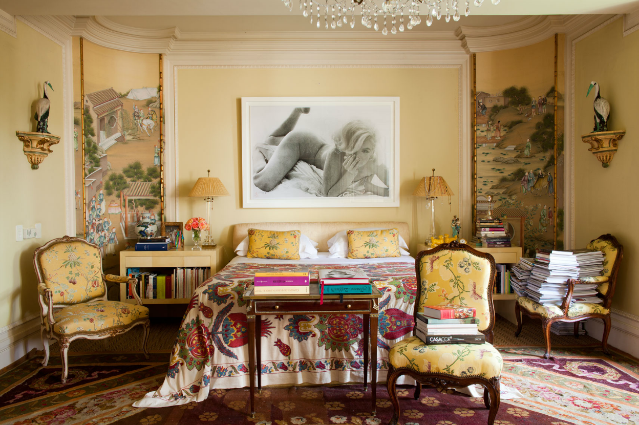
In the first photo, Amanda Nisbet's wild room for the Kip's Bay Showhouse uses a photo of pink glossed lips by Marilyn Minter. Another Marilyn, this one Monroe, presides over the bedroom of Brazilian architect Jorge Elias and his wife Lucila in the second image. I love how the lightness, curves, and playfulness of the photo (and its subject) contrast with as well as compliment the Chinoiserie feel.

And finally, I must report that I have tried to give equal time but I can't find an image of a bedroom that uses sexy images of men, which seems a little unlikely... there have to be some expertly designed bedrooms out there with a painting of a male torso or even a stylized Tom of Finland image. If any of my readers come across such a thing, let me know!

http://amandanisbetdesign.com/
Above photo by Trevor Tondro

http://www.jorgeelias.com.br/
Above photo by Roger Davies

And notice how, in all of these images, extra pillows offer more visual comfort as well as more opportunities to introduce color, texture, and pattern. I hope I have inspired you to think about ways to enhance your bedroom, and to make it even more of a special "destination."

Happy Valentine's Day and happy designing!

Monday, January 22, 2018

Fiorito Interior Design Sneak Peek: The Half Moon Bay Luxury Suite

I am very excited for this year to unfold as I have a lot of wonderful, fascinating projects brewing. And one of the most interesting ones is a complete home remodel for a house in a seaside town here on the Northern California coast. My clients intend on turning their sizable home into an Airbnb by utilizing two bedroom suites. The private areas of the house will still include a living-dining-kitchen space, a guest room/office and their own master suite.

The inspiration for the Airbnb suites came from neighboring seaside destinations and towns, so it seemed only fitting to keep that motif when it came time to design the master suite. I wanted the owner's suite to be luxurious and steps above the rental rooms, and the most luxurious nearby destination is certainly the exquisite Ritz Carlton Hotel in the lovely coastal town of Half Moon Bay.

Blending the colors of nature from the surroundings with the well-appointed luxury of a renowned five-star hotel, I came up with a palette of cream, champagne silver, sand, bleached driftwood, and foggy blue/grey. The organic elements within a refined setting makes for an intriguing and engaging contrast (see Design mantra #1 to the right, "Contrast brings interest!")


My clients have approved the style direction and work begins on the entire house soon. Stay tuned!

Happy designing!

Monday, June 9, 2014

Master Bedroom: From Blah to Aaaah by Fiorito Interior Design

An uninspiring bedroom bored my clients. They longed for a special place to retire at the end of a long, stressful day but were completely stymied and did not know how to accomplish that. The bedroom needed to function as a retreat from a hectic life with two young boys, and busy careers but what they had was a bland room without any soothing qualities whatsoever. And no time to invest in making it the oasis they craved.


They were happy with the pieces of furniture they had, so I decided to build on what was already there. Now, I am not usually a fan of matching pieces of furniture, but in this case, I got a second night table from the same line. While the bedroom was of average size, creating a sense of symmetry makes a larger cohesive unit for the eye to see. The result is a more generous expanse. This was helped with a set of sky blue porcelain lamps, creating a more grand sense of "place."

Hesitant to have anything over the bed since we live in earthquake country (there's nothing worse than being woken up at 3AM by an earthquake only to have a piece of framed art over the bed jump off the wall and conk one on the head!), we hung sumptuous chocolate Dupioni silk panels with a slight sheen behind the bed. This accomplishes two goals: 1) to visually extend the headboard and draw the eye upward (another way to make the space seem more "grand") and 2) to introduce more fabric into the space as a way to soften the room and create more of a cushioned, comforting feeling.  Custom made bedding in soothing aquas and rich chocolates, along with a vintage oil painting and a modern etching of Pacific seascapes completes this now tranquil and luxurious room.


Have a space that is troubling you? A spot you just can't tackle? Give me a call!

Happy designing!

Monday, March 31, 2014

The Master Suite by Fiorito Interior Design, Part Three

I am proud to present finished photos of a Master Suite project I started in the fall of 2012. While it was under construction, I wrote about it here and here, showing structural photos and installation progress: take a look to catch up and see the fascinating evolution of the space.

This project was not a simple cosmetic facelift or even a down-to-the-studs gut job. This was a full-on extension/addition that required me to work closely with the contractor and architect. The back portion of half of my clients' home was blown out to make way for a much larger master bedroom and bathroom. And all the disruption, construction, and wait was well worth it.

But before we ogle the reveal images, let's take a look at what the space looked like when I initially encountered it. You will see why my clients were eager to be rid of what they (and I) considered to be a very un-masterful master bathroom.

Like many California ranch homes built in the 1950s, this master bathroom was not really a "master bath." The concept of a "master bath" as we know it today didn't really exist then. My clients, who only three years ago purchased the home from the family of the original owner, were saddled with a small, dysfunctional space. Chief among the dysfunctions: a vanity only 30" high (my clients had to stoop quite low to lean on the counter), and an inconveniently placed window that forced the too-low vanity mirror to reflect only the waist and partial torso--not the face--of anyone standing in front of it.


A separate water closet with a pocket door was also the spot for a very narrow shower. That, my friends, was a master bathroom in 1956. And so my work began.


In order to refine a design concept for the soon-to-be larger space, and thereby narrow down material choices, my clients and I had a brainstorming session: we spoke of an elegant Old World/ European bedroom and bathroom, a luxurious bath that would reference a Roman spa, and finally the idea of a Hammam was brought into the mix. We blended these ideas together in oil-rubbed bronze fixtures, and a tiny mosaic vine pattern in beautiful Bursa Beige marble from Turkey and white Thassos marble from Greece. The extension of the house allowed us to create a true master suite which includes a greatly enlarged bedroom area, and a generous sized bathroom with a jetted soaking tub, a very large walk-in shower, a double-sided fireplace (facing the tub on the bath side), and a luxurious 8' long vanity with double sinks and a storage tower.

The vanity wall is covered with the imported mosaic vine pattern. The custom Larson Juhl framed mirrors are flanked by gorgeous hand-wrought scones from Hubbardton Forge which echo the vine and leaf pattern in the mosaic. And the vanity itself features an  LED strip in the toe-kick which allows my clients to see in the middle of the night without having to turn on a shockingly bright overhead fixture.

Photo by Bernardo Grijalva


At the other end of the master bath, a luxurious jetted tub nestles by a fireplace in the bay window area. Views of the garden can be seen while soaking in bubbles...

Photo by Bernardo Grijalva

Photo by Bernardo Grijalva

The over-sized walk-in shower features a paneled wainscoting effect which I designed to be executed in Crema Marfil marble. The vine mosaic continues in the shower, topped by green onyx squares. A rainshower head and a hand-held spray on a bar provides showering options. The shower floor slopes gently in one direction toward a hidden linear drain; this allows the floor to be read as a continuation of the main space, without being interrupted by a center drain.

Photo by Bernardo Grijalva


I have a few more finished projects coming up which I will be sharing with you soon. New posts are always scheduled every Monday!

In the meantime, happy designing!

Monday, February 10, 2014

A Salute To Bedrooms... For Valentine's Day

Since Valentine's Day is fast approaching, I thought I would create a salute to sensuality by featuring some luxurious, fun, luscious boudoirs.

One of the most basic ways to create an inviting bedroom retreat is to simply make the bed itself seem inviting. A padded and tufted headboard, as seen in the two photos below, sets the stage for a bed that appears sprawling, substantial...a comfortable place to spread out, a tranquil spot to relax on, a soft sensuous spot to roll around in...

A bed with an attractive base and headboard signals a sense of place and purpose.
In the first photo, the bed seems like a cushy cloud nestled on a plinth of warm, rich leather. Second image: the soft blue headboard and footboard by Jay Jeffers announces itself in this superbly relaxed yet sophisticated room.

http://jeffersdesigngroup.com/

Layering soft, sumptuous textures is another way to add a decadent sense to a bedroom. In the tactile room below, designed by Eric Kuster, we see hair-on-hide panels on the anchor wall, and a soft faux fur throw plays well with velvets and satins.

http://www.erickuster.com/

Speaking of fabrics, another way to soften a bedroom is to use fabric panels on the walls, a technique I have successfully used for clients (stay tuned, I will be posting a bedroom in which I used this marvelous trick). You can use drapery panels as a floor-to-ceiling headboard, like the first image. Or you can run panels along an entire wall, like Elizabeth Gordon did in the second image below. It's also good for dampening sound (wink wink).

http://www.elizabeth-gordon.com/

A dark color palette in a bedroom says moody, exotic, and romantic. The first image below by designer Smith Boyd features a delicious palette of browns, taupes, and greys along with textures like leather. The wood-grain striped wallpaper creates a natural, slightly wilder feeling that is tipped a little to the masculine side. The feeling of the dark purple Arabesque wallpaper in the next image is carried through by the Rococo mirrors and night tables... it feels like a fantasia on Mozart's "Abduction From The Seraglio!"

http://smithboydinteriors.com/

And think about dramatic, steamy, over-sized photos for an addition of extra sass and whimsy. In the first photo, Amanda Nisbet's wild room for the Kip's Bay Showhouse uses a photo of pink glossed lips by Marilyn Minter. Another Marilyn, this one Monroe, presides over the bedroom of Brazilian architect Jorge Elias and his wife Lucila in the second image. I love how the lightness, curves, and playfulness of the photo (and its subject) contrast with as well as compliment the Chinoiserie feel.
And finally, I must report that I have tried to give equal time but I can't find an image of a bedroom that uses sexy images of men, which seems a little unlikely... there have to be some expertly designed bedrooms out there with a painting of a male torso or even a stylized Tom of Finland image. If any of my readers come across such a thing, let me know!

http://amandanisbetdesign.com/
Above photo by Trevor Tondro

http://www.jorgeelias.com.br/
Above photo by Roger Davies

And notice how, in all of these images, extra pillows offer more visual comfort as well as more opportunities to introduce color, texture, and pattern. I hope I have inspired you to think about ways to enhance your bedroom, and to make it even more of a special "destination."

Happy Valentine's Day and happy designing!

Monday, September 2, 2013

The Master Suite by Fiorito Interior Design, Part Two

In my previous post about this project here, I shared photos of the exterior demolition and construction of the addition to the house. And now, as promised, here are some shots of the interior.

But first, let's take a look at what the space looked like when I initially encountered it. You will see why my clients were eager to be rid of what they (and I) considered to be a very unmasterful master bathroom.

Like many California ranch homes built in the 1950s, this master bathroom was not really a "master bath." The concept of a "master bath" as we know it today didn't really exist then. My clients, who only two years ago purchased the home from the family of the original owner, were saddled with a small, dysfunctional space. Chief among the dysfunctions: a vanity only 30" high (my clients had to stoop quite low to lean on the counter), and an inconveniently placed window that forced the too-low vanity mirror to reflect only the waist and partial torso--not the face--of anyone standing in front of it. (When I see things like this, I can only shake my head wonder what on earth the builder was thinking.)


A separate water closet with a pocket door was also the spot for a very narrow shower. That, my friends, was a master bathroom in 1956. And so my work began. As I mentioned here in the last post about this project, an extension of the space allowed us to create a true master suite which will include a greatly enlarged bedroom area, and a generous sized bathroom with a jetted soaking tub, a very large walk-in shower, a double-sided fireplace (facing the tub on the bath side), and a luxurious 8' long vanity with double sinks and a storage tower.


The bay window you saw in the last post will be the home of a generously proportioned jetted tub. Above: the framing of the walls, addition of windows, construction of the tub deck, and installation of the marble tub deck and face.


The adjacent spacious shower is going to rival the focal point of the tub. In the first few photos above, you can see the shower after being "hot-mopped" (a way to waterproof the shower pan) and the walls made of a version of waterproof sheetrock. The entrance to the shower is flanked by a pair of columns, topped with a gentle arch. For the shower walls, I designed a wainscoting effect with beveled panels, all crafted from lavish Crema Marfil marble from Spain.

And tiling began this week. The first element to be installed in the shower above the Crema Marfil wainscoting was the gorgeous mosaic vine border made of Bursa Beige marble from Turkey and white Thassos marble from Greece. This border will also serve as a back splash for the double vanity under a mosaic wall of the same material.

Like I said in the last post for this project, I am so anxious to see the final result.

Thanks for reading and happy designing!