Monday, February 17, 2020

History of Furniture: Shaker

In this chapter of our ongoing History of Furniture series, let's look at a simple design element that has really withstood the test of time. You probably know about the door profile that is referred to as a Shaker style door.


But do you know where this classic style came from?

The Shakers (officially called The United Society of Believers in Christ's Second Appearing) were a Christian sect founded in England in the 1700s that later settled in colonial America a few decades after their founding. For a Christian sect at that time, they held surprisingly progressive views: they were pacifists, they valued equality between the sexes with women taking on leadership roles within the society (reflecting their belief that God is both male and female), and they lived a communal lifestyle. They practiced celibacy--sex was forbidden for members and because of this, child-rearing was not something the Shakers often did, save for a woman who might be pregnant at the time of her admittance to the Shaker society or the adoption of homeless orphans. This meant that the Shaker population would naturally dwindle. They welcomed this idea and at this point, in 2020, there are only 2 (yes, TWO) remaining members of the Shaker society in the world.

But in their earlier days, their beliefs led them to live in austere ways that were highly functional and completely devoid of ornamentation. They practiced restraint and economy in all things. The classic Shaker cabinet door is what is called a 5-piece: 2 rails at the top and bottom, 2 side stiles, and a center panel, all without any carving or embellishment.


The Shakers were supremely adept and ingenious at inventions and interior developments to help make cleaning and organizing that much easier and faster. They installed peg rails around rooms so chairs could be stowed up and out of the way when not in use, making it easier to sweep or mop a floor. These peg rails also conveniently held other every day items like brooms and hats.

Photo by Erin Little

But the Shakers were not collectors or ones to value objects, so their interiors were often a bit bare with plenty of negative space. But this leads me to reflect on the Zen idea of negative space being full. Since the Shakers were a religious sect, their interest in this kind of austerity and minimalism certainly had its roots in the belief that negative space was not "nothing" but full of something whether that might be energy, God, or space itself. There is a kind of lovely ease and peace that can come with an uncomplicated, organized interior which allows one to reflect inward.

A bedroom in a "dwelling house" at the Canterbury Shaker Village, Canterbury, New Hampshire. Photo by Erin Little 

The peg rails held the classic cane-seated Shaker chair which came in flat and rocking versions.


The Shakers were also masters of woodworking and made beautiful, simple baskets and boxes of bent wood. These classic Shaker boxes are highly valued.


Here is a shot of the Shaker Retiring Room on display at the Metropolitan Museum in New York City, featuring various authentic Shaker objects.


Happy designing!

Monday, February 10, 2020

Fiorito Interior Design Press Update, February 2020

I was interviewed by Erik J. Martin for an article about refreshing the design of your home in the winter months. This came out last winter on the ION Television website blog but I failed to point to it at the time, so here it is! I'm item #2!


Happy designing!

* For the record, I do not condone the use of Shabby Chic under any circumstances.

Monday, January 27, 2020

Legends of Design: Tony Duquette

Although considered more of an artist than an interior designer, Tony Duquette did indeed create many memorable interiors both residential and commercial and deserves to be profiled in our continuing Legends of Design series.


Duquette was born in 1914 in Los Angeles but grew up between L.A. and Three Rivers, Michigan where his family lived part of the year. He attended The Chouinard Art Institute (which, in 1961 became the California Institute of the Arts) on a scholarship and after graduating, he began working freelance for interior and fashion designers like Billy Haines and Adrian. Soon after he was discovered by interior designer and socialite Elsie de Wolfe (previously here) and started creating sets for film studios such as MGM as well as theatrical and operatic productions.

As an artist, he had many prestigious one-man shows at museums like Los Angeles County Museum of Art, the M. H. de Young Museum and Palace of the Legion of Honor in San Francisco, the California Museum of Science and Industry and the Municipal Art Gallery in Los Angeles, the El Paso Museum of Art, the Santa Barbara Museum of Art, and the Museum of the City of New York. And how is this for pedigree: he was the first American to have a one-man show at the Louvre.

But through this all, he designed interiors for people's homes, creating his own art work in the form of light fixtures, wall hangings, and textiles. His work in film and stage lent a highly theatrical, presentational sense to the interiors he created. Indeed, his work later became known as Hollywood Regency.


Most fascinating, Duquette and his wife lived in many different homes over the years, most of them cobbled together from salvaged architectural pieces of other buildings.

The Tony Duquette Studio was located at 824 North Robertson Blvd. in West Hollywood. Originally constructed as a movie studio for the silent film star Norma Talmadge, the Duquettes purchased the building in the early 1950’s as a ruin and remodeled and restored the structure as their residence and studio. At the entrance was a pair of 16th century Spanish doors, carved wooden horses from a palace in Chiang Mai Thailand, and Duquette’s own lighted “Whale Vertebrae” stand lamps.


The “big room” at the Tony Duquette Studios was 150′ long and 25′ wide with 28′ high ceilings and furnished with the Duquettes’ collections of 17th, 18th and 19th century European and Asian antiques as well as their own works of art and furniture designs. Duquette built the stage at the end of the room in order to showcase sections of ballets, operas, and film costumes and sets. The stage was also used for the Duquettes’ own lavish entertainments as well as for dining. Over the years, Duquette added to and remodeled this "big room," culminating in a 1960s hippie light show!


The Duquettes also lived in Beverly Hills in a home they dubbed Dawnridge. Originally a 30' x 30" box, Duquette and his wife tricked it out with a bold combination of European and Asian antiques.


The terraces, grounds, and gardens of Dawnridge were extensive. Deep in the gardens was the “Little Thai House,” created from an existing structure by adding architectural fragments from Thailand and Bali as well as English gothic spires and Victorian gingerbread salvaged from Los Angeles’ historic Bunker Hill neighborhood.


But the most lavish of the Duquette properties must have been the Sortilegium (Latin for "fortune-telling").

In the 1950’s Tony and Elizabeth Duquette purchased a 150 acre property high in the Malibu mountains above the Pacific Ocean. Over the next 30 years they spent each weekend at the property which they lovingly dubbed, “The Empire” creating an enclave of pagodas, pavilions, studios, and houses on which they lavished their many talents, collections, decorations, and magic. Duquette's website says that each structure had a name which corresponded with its decorative theme. “Ireland” was composed of 19th century shop fronts purchased in Dublin; “Bullocks Wilshire” was decorated with authentic Art Deco furnishings (Duquette had decorated the original Bullocks department store in Los Angeles during the 1930s); “Horn Toad” was decorated with Victorian ginger bread and Americana.; “China” was a riot of red lacquer and gold leaf dragons, sedan chairs and Chinese embroideries; “Goom” was named after a town in India; “Portugal” was a large barn filled with 18th century carvings; “Bosphorus” was a domed and minerated structure which held garden implements; “The Star Barn” was full of old props from MGM; “The Ball Room” made of 18th century French windows from Paris with their original hardware “just like jewelry”, parquet de Versailles floors, carved 18th century wooden fireplaces and original Tony Duquette chandeliers; “Hamster House” was originally a 1920’s wooden mobile home which Tony expanded and added to and which ended up as a really rather grand house which was featured in all of the glossy shelter magazines; “Rose Parade” which was a long narrow structure filled with plants and Victoriana, the roof of which Tony used for parties and exercise under embroidered Indian parasols. But most important was Duquette's own house, “Frogmore” that originated as a 20′ x 20′ metal building which was being thrown out on Santa Monica Blvd.: the owners paid Tony to take away! He turned that discarded 20′ x 20′ building into a compound which included a 2 story studio, kitchen, bathroom, bedroom wings, and an entire covered terrace as well as a huge cantilevered deck where he could entertain 150 people for lunch.


The property and its 21 structures tragically burnt to the ground in the Green Meadows Malibu fire in the 1990’s.

His maximalist work influenced a slew of designers including Kelly Wearstler. And for the last few decades of his life, Duquette's business partner was Hutton Wilkinson who now owns and runs the Tony Duquette design firm. Light fixtures and textiles (seen here) are still in production! Visit the website to learn more.

Happy designing!

Monday, January 13, 2020

White: A Blank Page Or Canvas 2020

Hello past, current, and future clients, and regular readers and followers: welcome to 2020. As we begin a new year with promise and the possibility of much-needed change and optimism stretched out before us, I am reminded of these words from "Sunday In The Park With George" by the legendary Stephen Sondheim: "White: a blank page or canvas...so many possibilities." Here in the western world, white represents purity. It is basic, untouched, unformed. These are the qualities of a blank piece of paper or a painter's canvas, ready to absorb any ideas and to support whatever might be created upon it.

There are those in the interior design world who think that white is a lost opportunity for color, and being more of a maximalist myself, I might lean in that direction, but I can't deny the allure of the absence of color as well. White can be a bold statement as much as any hue and the following white rooms speak volumes.


Happy designing!

Monday, December 30, 2019

Happy New Year! Welcome 2020!


Happy New Year to all my followers and regular readers. May 2020 be a healing, peaceful, and prosperous year for the planet.

See you soon for the first post of 2020. Until then, Happy Designing!

Monday, December 23, 2019

Happy Winter Solstice and Happy Holidays 2019!

This year, 2019, the Winter Solstice--the shortest day and longest night of the year--for the northern hemisphere happened this Saturday, December 21st. I am wishing everyone a Happy Winter Solstice and a beautiful and joyous Holiday Season!

Monday, December 9, 2019

Fiorito Interior Design Sneak Peek: A Master Bathroom In Progress

Regular readers will know that I usually only post photos of completed projects, but every now and then I am so excited about a remodel, I need to share a bit of the process and progress before my photographer comes in to document the finished space. A current whole-house remodel I've been working on for over a year is nearly done and has turned out to be lovely, but the pinnacle is the master bathroom.

The original master bath of this 50+ year-old house was much smaller before we added on to the home and rebuilt the master suite. While still compact, we poured a lot of style and unique materials into the new bathroom and I am so thankful that my clients were eager for something special...and not afraid of pattern!

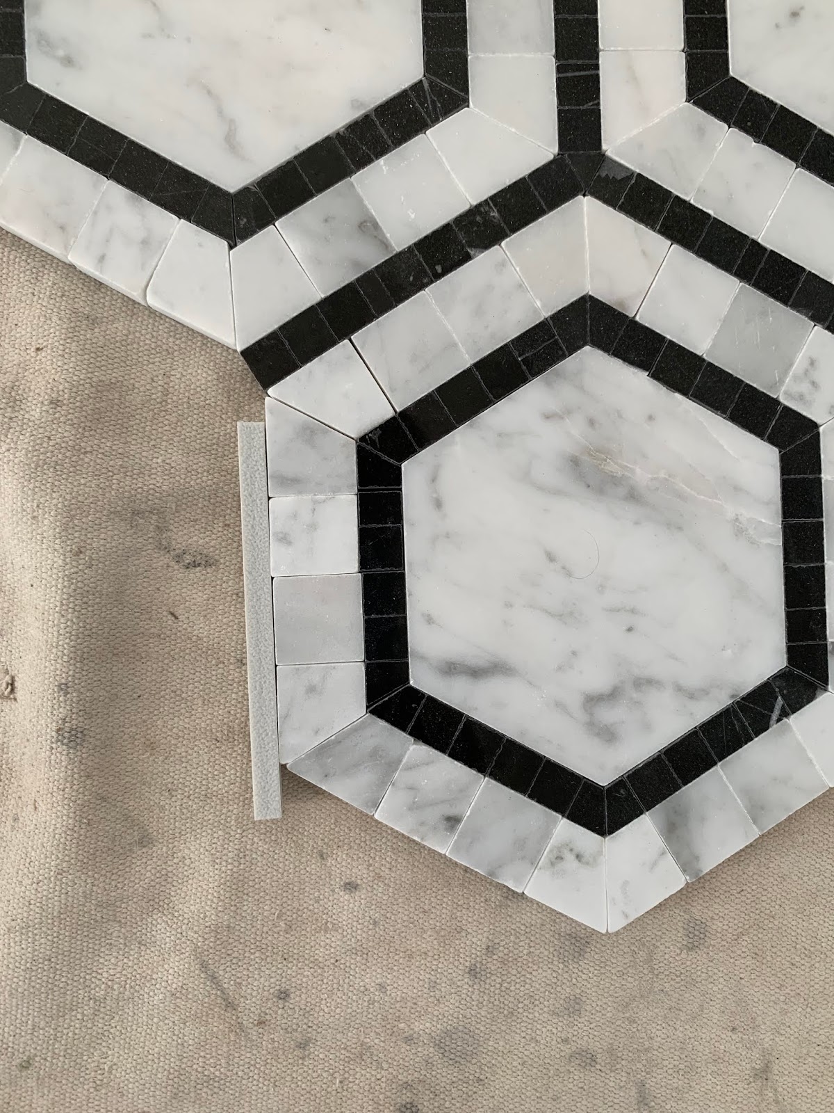
We found a fascinating tile for the floor...a hex pattern where each hex is bordered by a tiny 1/2" x 1/2  and then a 1" x 1" mosaic. It was a bold move to decide to put this tile on the floor and we were all so excited to see the results...


Here are some conceptual renderings of the original idea.


But as I say in my second Design Mantra to the right, design is a process and things always morph and change as the life of a project continues...that is the fun of design. Our color palette shifted from warm to cool and we chose the Carrara and Nero Marquina marble version of the flooring. The field tile on the return walls became bright white, and most excitingly, we discovered a glorious Carrara fish-scale mosaic for the main wall of the shower.


Picking the right grout color allows the tile shapes to be highlighted or hidden. In our case, we ended with a much brighter white than what you see below in order to highlight the texture of the fan-shaped tiles. The flooring grout stayed grey so as to blend in and not interrupt the pattern that drew us to it in the first place. And of course we matched the white tiles on the return walls as there is no need to draw attention to them. They are supporting players, not the star.


A large bench and large, long niche provide flexible function in the shower.


And here is our glorious tile on the floor (a linear drain allowed us to build a zero clearance shower and to run the floor tile right to the back wall!) and the shower walls with the special fan-shaped mosaic...all grouted and awaiting the installation of a glass enclosure.


I'm very excited for the rest of the house to be completed. Stay tuned in 2020 for beauty shots of this bathroom as well as guest bathrooms and a lovely blue and white kitchen!

Happy designing!