Designed and developed in the late 1950s and early 60s, the Marshmallow sofa came from the imagination of Irving Harper who was working for George Nelson Associates at the time. For many years, the sofa was attributed to Nelson himself, but it is now widely known that Harper was actually responsible.
It is a classic of Modernist design. Referencing Pop Art, the Atomistic style, and the Space Age (the latter two growing from the blossoming field in the 1950s of "better living through science"), its playful yet cool sense seems like it would be at home in a vintage James Bond film, or Kubrick's "2001: A Space Odyssey"... or perhaps it would fit right in with your own mid-century lounge or living room!
The Marshmallow sofa is available from Herman Miller, here.
Happy designing!
Monday, March 3, 2014
Fiorito Interior Design Press Update, March 2014
I just want to let my readers know that I can now be found on Room Reveal, a wonderful new website that features interior designers and their portfolios.
Fiorito Interior Design is currently listed on Houzz, Porch, and Home and Garden Design Ideas and Room Reveal makes a nice addition.
And I was also pleased to learn that this blog was linked on the Oprah website for an article about sofas. I was wondering why my page about the antique Knole sofa was getting so many hits, and I took a look at the traffic to see Oprah as a source! Thanks, Oprah!
Happy designing!
Fiorito Interior Design is currently listed on Houzz, Porch, and Home and Garden Design Ideas and Room Reveal makes a nice addition.
And I was also pleased to learn that this blog was linked on the Oprah website for an article about sofas. I was wondering why my page about the antique Knole sofa was getting so many hits, and I took a look at the traffic to see Oprah as a source! Thanks, Oprah!
Happy designing!
Monday, February 24, 2014
Wallpaper: The Concrete Collection
I love wallpaper but so often clients look at me with horror if I even utter the word. People have associations, as we all do, with certain things. But it seems like wallpaper is one of the most misunderstood and maligned of interior elements. If you are old enough, you might have a living memory of your mother's kitchen wallpaper that featured repeated bouquets of autumn-colored flowers next to an image of an old fashioned crank coffee grinder... or perhaps your grandmother's bathroom that had a paper of abstract streaks on smoked metallic foil.
Years ago, there was not a lot of choice when picking wallpaper. But now, there is an entire universe of amazing, beautiful, sexy, interesting, chic, luxurious, stylish wallpapers to choose from. There is no need to fear wallpaper. There is little chance of having your kitchen or bath end up looking like something you remember--with a chill--from your childhood.
I have to say I am excited at the prospect of using this marvelous wallpaper product designed by Norwegian professional and commercial photographer Tom Haga. The Concrete Wall collection is the result of photographing raw and refined concrete walls, raw cinder block walls, and even graffiti, in locations across Norway. The photographic images are printed onto a high-quality vinyl, making the paper washable, easy to care for, and easy to install (just use regular wallpaper paste!). And the website says that no pattern is ever repeated! I am not sure how that feat is achieved, but even if one found a repeat, it is still a great way to get that industrial/ urban/ loft look anywhere!
http://concretewall.no/concrete-collection
If you want your living room to look like a cool, downtown loft with a concrete wall, this is the product for you!
I will be talking about other types and styles of wallpaper, different manufacturers, and unique applications in a series of future posts.
Stay tuned and happy designing!
Years ago, there was not a lot of choice when picking wallpaper. But now, there is an entire universe of amazing, beautiful, sexy, interesting, chic, luxurious, stylish wallpapers to choose from. There is no need to fear wallpaper. There is little chance of having your kitchen or bath end up looking like something you remember--with a chill--from your childhood.
I have to say I am excited at the prospect of using this marvelous wallpaper product designed by Norwegian professional and commercial photographer Tom Haga. The Concrete Wall collection is the result of photographing raw and refined concrete walls, raw cinder block walls, and even graffiti, in locations across Norway. The photographic images are printed onto a high-quality vinyl, making the paper washable, easy to care for, and easy to install (just use regular wallpaper paste!). And the website says that no pattern is ever repeated! I am not sure how that feat is achieved, but even if one found a repeat, it is still a great way to get that industrial/ urban/ loft look anywhere!
http://concretewall.no/concrete-collection
If you want your living room to look like a cool, downtown loft with a concrete wall, this is the product for you!
I will be talking about other types and styles of wallpaper, different manufacturers, and unique applications in a series of future posts.
Stay tuned and happy designing!
Monday, February 17, 2014
Four Easy Steps For Picking Paint Colors
So you’ve decided to paint a wall, a room, or your whole house. Congratulations! Many people are too afraid of color to try it yet paint is the easiest and quickest way to bring a new, fresh look to your home. But there are a few things you should definitely keep in mind during the process of picking paint colors.
Step One: Like a color
To start, if you are drawn to a specific hue, explore that color family. If you are not, start with an inspiration—a piece of art work, a pillow, a rug, even a piece of clothing can provide a color palette or direction. You can also choose a color palette based on established color schemes which I covered here in a prior post entitled “Let’s Talk About Color: Four Color Schemes To Know And Love.”
Step Two: Find a paint chip
Your next step is to go to the paint store and browse chips: those are the little squares of color that often come on a strip of paper, sometimes five or six to a strip. It can often be a little overwhelming looking at so many different tints, tones, and shades of the same hue, so here is something that might help you to keep some sense: generally, the middle color on a strip, or color family, is the pure hue. Then the color lightens (a tint) and darkens (a shade) on either side of the parent color. This is why it is called a color family.
When looking at paint swatches, please please please hold them up vertically, as if you are looking at them on the wall. The way the light falls onto a surface dramatically changes the intensity and hue of a color. You may have encountered this with fabric. It is amazing how different the color of a shirt can appear when it is draped across a bed waiting to be worn versus how it looks on a hanger.
Step Three: View the color in your space
Once you have chosen a color—or colors (you go, you color daredevil!)—you will want to look at samples of the paint. For your next purpose, the tiny swatch you get at the paint store kiosk will not cut it. You need to see the color in a large format. Buy the largest swatch the paint manufacturer sells or better yet, buy a tester pot.
Either tape the swatch to the wall, or—and this is my preferred method—paint the color on your walls. Now here is an extra step that many people miss when painting sample patches but it will help you to more clearly and confidently choose a color: if your current walls are not white, you need to paint the wall a white color-blocking primer first, since wall colors can bleed through certain paints and interfere with the way the color reads on the wall. It is best to start with a blank white surface in order to achieve the purest form of the color.
Live with the color(s) on the wall(s) for a few days. The next step is very important: watch at different times of the day—and evening—to see how the hue changes with the changing light. If you like a hue in the daytime, but it turns a yucky color at night, then that is probably not a color you would want to paint, say, your bedroom, since you will be seeing the color mostly at night! Also keep in mind color-bounce from outdoors: if you have a large expanse of green lawn outside of a large window in your room, your color will be tinged with green at different times of the day. If you live next to a building whose wall is a light color, your chosen hue most likely will end up being much more intense at certain times due to increased light bouncing into your space.
Step Four: Pick your paint!
But before you make a final decision, remember that if you are painting an entire room a hue, that color will intensify because any light will make it reflect from the adjacent walls back onto itself. It will create a kind of visual feedback loop. Your paint will come in a variety of finishes as well. You will want to pick a finish based on where the wall is and what kind of traffic it is going to see. Kitchens and bathrooms generally take a semi-gloss since that finish allows for the most ability to be cleaned. Walls that are highly textured with an orange peel plaster for example, should not be painted in a high gloss--the pits, crags, and bumps of the plaster will only be highlighted by the gloss, creating shadows on every irregularity. For these walls it is best to use a satin or pearl finish.
Sometimes people ask if paint dries darker or lighter. This is a tricky question to answer since ideally, the paint should dry to match the exact hue on the swatch. Having said that, not all paint is created equal. Like with almost everything in life, one gets what one pays for, and paints of higher quality tend to behave better (they go on smoother, less brush strokes/roller marks, better coverage, and more pigments so the colors are more saturated, etc.). But when paint is wet, no matter if it is high or lesser quality, all bets are off. It is hard to tell before it dries. Lesser quality paints that have less pigment tend to go on dark and dry up to the hue. Higher quality paints tend to go on lighter and dry down to the hue. So don’t panic when the paint is being applied. It will look different when dry.
Keep in mind that your space, when being prepped and painted, is devoid of drapes, rugs, furniture, and art on the walls. If the color you have chosen seems too intense or too much, remember that probably much of it will be hidden by furnishings, drapes, and art. You are going to end up seeing less than what you see when the room is bare.
Of course picking a paint color can and should be tied in to all the other elements in a room, or perhaps the rest of the house... and if you want an advocate to help you out, give me a call!
Happy designing!
Monday, February 10, 2014
A Salute To Bedrooms... For Valentine's Day
Since Valentine's Day is fast approaching, I thought I would create a salute to sensuality by featuring some luxurious, fun, luscious boudoirs.
One of the most basic ways to create an inviting bedroom retreat is to simply make the bed itself seem inviting. A padded and tufted headboard, as seen in the two photos below, sets the stage for a bed that appears sprawling, substantial...a comfortable place to spread out, a tranquil spot to relax on, a soft sensuous spot to roll around in...
A bed with an attractive base and headboard signals a sense of place and purpose.
In the first photo, the bed seems like a cushy cloud nestled on a plinth of warm, rich leather. Second image: the soft blue headboard and footboard by Jay Jeffers announces itself in this superbly relaxed yet sophisticated room.
Layering soft, sumptuous textures is another way to add a decadent sense to a bedroom. In the tactile room below, designed by Eric Kuster, we see hair-on-hide panels on the anchor wall, and a soft faux fur throw plays well with velvets and satins.
Speaking of fabrics, another way to soften a bedroom is to use fabric panels on the walls, a technique I have successfully used for clients (stay tuned, I will be posting a bedroom in which I used this marvelous trick). You can use drapery panels as a floor-to-ceiling headboard, like the first image. Or you can run panels along an entire wall, like Elizabeth Gordon did in the second image below. It's also good for dampening sound (wink wink).
A dark color palette in a bedroom says moody, exotic, and romantic. The first image below by designer Smith Boyd features a delicious palette of browns, taupes, and greys along with textures like leather. The wood-grain striped wallpaper creates a natural, slightly wilder feeling that is tipped a little to the masculine side. The feeling of the dark purple Arabesque wallpaper in the next image is carried through by the Rococo mirrors and night tables... it feels like a fantasia on Mozart's "Abduction From The Seraglio!"
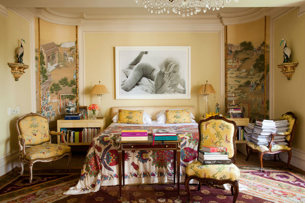
And think about dramatic, steamy, over-sized photos for an addition of extra sass and whimsy. In the first photo, Amanda Nisbet's wild room for the Kip's Bay Showhouse uses a photo of pink glossed lips by Marilyn Minter. Another Marilyn, this one Monroe, presides over the bedroom of Brazilian architect Jorge Elias and his wife Lucila in the second image. I love how the lightness, curves, and playfulness of the photo (and its subject) contrast with as well as compliment the Chinoiserie feel.
And finally, I must report that I have tried to give equal time but I can't find an image of a bedroom that uses sexy images of men, which seems a little unlikely... there have to be some expertly designed bedrooms out there with a painting of a male torso or even a stylized Tom of Finland image. If any of my readers come across such a thing, let me know!
And notice how, in all of these images, extra pillows offer more visual comfort as well as more opportunities to introduce color, texture, and pattern. I hope I have inspired you to think about ways to enhance your bedroom, and to make it even more of a special "destination."
Happy Valentine's Day and happy designing!
One of the most basic ways to create an inviting bedroom retreat is to simply make the bed itself seem inviting. A padded and tufted headboard, as seen in the two photos below, sets the stage for a bed that appears sprawling, substantial...a comfortable place to spread out, a tranquil spot to relax on, a soft sensuous spot to roll around in...
A bed with an attractive base and headboard signals a sense of place and purpose.
In the first photo, the bed seems like a cushy cloud nestled on a plinth of warm, rich leather. Second image: the soft blue headboard and footboard by Jay Jeffers announces itself in this superbly relaxed yet sophisticated room.
Layering soft, sumptuous textures is another way to add a decadent sense to a bedroom. In the tactile room below, designed by Eric Kuster, we see hair-on-hide panels on the anchor wall, and a soft faux fur throw plays well with velvets and satins.
Speaking of fabrics, another way to soften a bedroom is to use fabric panels on the walls, a technique I have successfully used for clients (stay tuned, I will be posting a bedroom in which I used this marvelous trick). You can use drapery panels as a floor-to-ceiling headboard, like the first image. Or you can run panels along an entire wall, like Elizabeth Gordon did in the second image below. It's also good for dampening sound (wink wink).
A dark color palette in a bedroom says moody, exotic, and romantic. The first image below by designer Smith Boyd features a delicious palette of browns, taupes, and greys along with textures like leather. The wood-grain striped wallpaper creates a natural, slightly wilder feeling that is tipped a little to the masculine side. The feeling of the dark purple Arabesque wallpaper in the next image is carried through by the Rococo mirrors and night tables... it feels like a fantasia on Mozart's "Abduction From The Seraglio!"
And think about dramatic, steamy, over-sized photos for an addition of extra sass and whimsy. In the first photo, Amanda Nisbet's wild room for the Kip's Bay Showhouse uses a photo of pink glossed lips by Marilyn Minter. Another Marilyn, this one Monroe, presides over the bedroom of Brazilian architect Jorge Elias and his wife Lucila in the second image. I love how the lightness, curves, and playfulness of the photo (and its subject) contrast with as well as compliment the Chinoiserie feel.
And finally, I must report that I have tried to give equal time but I can't find an image of a bedroom that uses sexy images of men, which seems a little unlikely... there have to be some expertly designed bedrooms out there with a painting of a male torso or even a stylized Tom of Finland image. If any of my readers come across such a thing, let me know!
Above photo by Trevor Tondro
Above photo by Roger Davies
And notice how, in all of these images, extra pillows offer more visual comfort as well as more opportunities to introduce color, texture, and pattern. I hope I have inspired you to think about ways to enhance your bedroom, and to make it even more of a special "destination."
Happy Valentine's Day and happy designing!
Monday, February 3, 2014
Milk Paint From Harley Farms
Milk paint has been used for thousands of years, since the ancient Egyptians. It is literally a mixture of milk and lime, with or without added pigments for color. Casein, a group of phosphoproteins found in milk, is an agent that makes milk paint fast drying and water soluble. And it is precisely that quality that gives tempera and frescoes their old-world texture. Milk paint has a suede-like appearance and a nice depth of color.
There are currently many companies that make milk paint but many on the market can be toxic--and caustic which can require one to wear gloves when painting! But now Harley Farms, a working goat farm and dairy here in Northern California, has formulated their own milk paint which they call FarmPaint. It is completely non-toxic, non-caustic, contains no VOCs (volatile organic compounds: information here)... and they say you can lick the drips off your hands!
Harley Farms FarmPaint is available in nine colors, and can be used on any paintable surface, inside or outside. Visit their website to learn more about FarmPaint. And visit their on-line store to purchase tester pots or quarts of FarmPaint! They ship to anywhere in the United States.
Take a look at the applications below. Milk paint is great for any time you wish to create an old-world or rustic farm feeling. A wash of turquoise on plaster brings to mind the blue and white of houses on Greek islands. And red makes me think of barns in the picturesque rural areas of New England.
Harley Farms, a restored 1910 dairy farm with 200 alpine goats on nine acres of pasture, is located in the beautiful seaside village of Pescadero, on Highway 1, about 20 miles south of Half Moon Bay here in Northern California. If any of my readers are local, consider visiting for a tour of the farm (including a fascinating peek into the milking barn, and a visit to the cheese making room), a chance to pet the baby goats in spring, or just to drop by the cheese shop and pick up some of their award-winning cheeses (Harley Farms are consistent winners at the American Cheese Society awards, and they hold two international World Cheese Show medals!). I've been many times, including in the spring when the babies are still soft!
http://www.harleyfarms.com/
There are currently many companies that make milk paint but many on the market can be toxic--and caustic which can require one to wear gloves when painting! But now Harley Farms, a working goat farm and dairy here in Northern California, has formulated their own milk paint which they call FarmPaint. It is completely non-toxic, non-caustic, contains no VOCs (volatile organic compounds: information here)... and they say you can lick the drips off your hands!
Harley Farms FarmPaint is available in nine colors, and can be used on any paintable surface, inside or outside. Visit their website to learn more about FarmPaint. And visit their on-line store to purchase tester pots or quarts of FarmPaint! They ship to anywhere in the United States.
Take a look at the applications below. Milk paint is great for any time you wish to create an old-world or rustic farm feeling. A wash of turquoise on plaster brings to mind the blue and white of houses on Greek islands. And red makes me think of barns in the picturesque rural areas of New England.
Harley Farms, a restored 1910 dairy farm with 200 alpine goats on nine acres of pasture, is located in the beautiful seaside village of Pescadero, on Highway 1, about 20 miles south of Half Moon Bay here in Northern California. If any of my readers are local, consider visiting for a tour of the farm (including a fascinating peek into the milking barn, and a visit to the cheese making room), a chance to pet the baby goats in spring, or just to drop by the cheese shop and pick up some of their award-winning cheeses (Harley Farms are consistent winners at the American Cheese Society awards, and they hold two international World Cheese Show medals!). I've been many times, including in the spring when the babies are still soft!
http://www.harleyfarms.com/
Monday, January 27, 2014
History of Furniture: Bauhaus and De Stijl
After the opulence, glitter, and excess of the holiday season passes, my mind usually turns to more simple forms and styles. After the shiny ornaments are put away, we are left with bare branches and grey skies. With this in mind, this installation of History of Furniture focuses on two simple, sleek styles from the early part of the 20th century known as Bauhaus, or International Style, and its counterpart De Stijl (deh STEEL).
The Bauhaus School was founded by architect Walter Gropius in Weimar, Germany in 1919. The Bauhaus Manifesto touted the unity of all arts, and emphasized the idea that artists are actually craftsmen. "Salon art" is a "world that must build again," according to the manifesto. "Let us then create a new guild of craftsmen without the class distinctions that raise an arrogant barrier between craftsman and artist! Together let us desire, conceive, and create the new structure of the future..." Gropius proclaimed that "we want an architecture adapted to our world of machines, radios and fast cars." The Bauhaus school was heavily influenced by Modernism. The long list of teachers and students who graduated from the school forged a new, abstract, spartan sensibility that went on to influence generations and decades to come. The movement's influence can still be felt, especially with the return in popularity of Mid-Century Modern design.
Concurrently in The Netherlands, a similar idea was brewing in a movement called De Stijl, or "the Style," founded in 1917, in which total abstraction and a simplification to basic shapes and colors was promoted. Although the two movements are referred to under their respective names and produced work that is identifiable as belonging to one movement or another, there was enough crossover and similarity to warrant my presenting them together for this post. In fact, Dutch painter and De Stijl founder Theo van Doesburg moved to Weimar to teach at the Bauhaus.
The Bauhaus style announced itself in the main structure when the school moved from Weimar to Dessau. The no-nonsense concrete, steel, and glass elements set off the Bauhaus font beautifully.
The furniture, rugs, and pottery that came out of the school were equally as severe, startling, and ultimately functional as the building itself. Take a look.
The famous Bauhaus child's cradle designed by Peter Keler was a traditional idea distilled down to only what was necessary for its function. Keler used a theory of color and shape developed by one of his teachers, the painter Wassily Kandinsky, to fashion the piece from a square, a circle, and a triangle.
Below we can see the classic lamp designed by Bauhaus follower Wilhelm Wagenfeld. Next to it are some multi-colored Bauhaus nesting tables. As always with Bauhaus, form (and style) follows function.
One of the most famous Bauhaus designers (both a student and later a teacher) created one of the most famous chairs in history: the Wassily Chair by Marcel Breuer. It was revolutionary at the time because the German steel manufacturer Mannesmann had recently perfected a way of producing steel tubing without any seams, making the bend of the steel frame possible. The taut black leather gives it a very architectural look.
Breuer also created one of the most copied chairs of the 20th century, the Cesca Chair, made of steel tubing and a woven cane back and seat. My parents had these chairs at our dining table when I was growing up.
Meanwhile in The Netherlands, De Stijl designer Gerrit Reitveld was almost single-handedly changing the way the Dutch saw furniture. He had a close artistic friendship with the artist Piet Mondrian whose rigid canvases of squares and rectangles served as inspiration and fodder for Reitveld's own ideas about the nature of design, and the importance of horizontal and vertical planes.
His most famous chair, the Red and Blue Chair, held to the De Stijl self-imposed restriction of using only primary colors along with black or white.
He created many other pieces, all adhering to the same properties and ideas he developed. Below we can see a buffet, a side table, his iconic Zig-Zag chair, and finally, his masterpiece, the Berlin Chair.
We can see echoes of Bauhaus and De Stijl in subsequent design movements like Mid-Century Modernism in the 1950s, clear through to the 1980s with the Memphis Style, both of which we will be examining in future posts.
In the meantime, happy designing!
The Bauhaus School was founded by architect Walter Gropius in Weimar, Germany in 1919. The Bauhaus Manifesto touted the unity of all arts, and emphasized the idea that artists are actually craftsmen. "Salon art" is a "world that must build again," according to the manifesto. "Let us then create a new guild of craftsmen without the class distinctions that raise an arrogant barrier between craftsman and artist! Together let us desire, conceive, and create the new structure of the future..." Gropius proclaimed that "we want an architecture adapted to our world of machines, radios and fast cars." The Bauhaus school was heavily influenced by Modernism. The long list of teachers and students who graduated from the school forged a new, abstract, spartan sensibility that went on to influence generations and decades to come. The movement's influence can still be felt, especially with the return in popularity of Mid-Century Modern design.
Concurrently in The Netherlands, a similar idea was brewing in a movement called De Stijl, or "the Style," founded in 1917, in which total abstraction and a simplification to basic shapes and colors was promoted. Although the two movements are referred to under their respective names and produced work that is identifiable as belonging to one movement or another, there was enough crossover and similarity to warrant my presenting them together for this post. In fact, Dutch painter and De Stijl founder Theo van Doesburg moved to Weimar to teach at the Bauhaus.
The Bauhaus style announced itself in the main structure when the school moved from Weimar to Dessau. The no-nonsense concrete, steel, and glass elements set off the Bauhaus font beautifully.
The furniture, rugs, and pottery that came out of the school were equally as severe, startling, and ultimately functional as the building itself. Take a look.
The famous Bauhaus child's cradle designed by Peter Keler was a traditional idea distilled down to only what was necessary for its function. Keler used a theory of color and shape developed by one of his teachers, the painter Wassily Kandinsky, to fashion the piece from a square, a circle, and a triangle.
Below we can see the classic lamp designed by Bauhaus follower Wilhelm Wagenfeld. Next to it are some multi-colored Bauhaus nesting tables. As always with Bauhaus, form (and style) follows function.
One of the most famous Bauhaus designers (both a student and later a teacher) created one of the most famous chairs in history: the Wassily Chair by Marcel Breuer. It was revolutionary at the time because the German steel manufacturer Mannesmann had recently perfected a way of producing steel tubing without any seams, making the bend of the steel frame possible. The taut black leather gives it a very architectural look.
Breuer also created one of the most copied chairs of the 20th century, the Cesca Chair, made of steel tubing and a woven cane back and seat. My parents had these chairs at our dining table when I was growing up.
Meanwhile in The Netherlands, De Stijl designer Gerrit Reitveld was almost single-handedly changing the way the Dutch saw furniture. He had a close artistic friendship with the artist Piet Mondrian whose rigid canvases of squares and rectangles served as inspiration and fodder for Reitveld's own ideas about the nature of design, and the importance of horizontal and vertical planes.
His most famous chair, the Red and Blue Chair, held to the De Stijl self-imposed restriction of using only primary colors along with black or white.
He created many other pieces, all adhering to the same properties and ideas he developed. Below we can see a buffet, a side table, his iconic Zig-Zag chair, and finally, his masterpiece, the Berlin Chair.
We can see echoes of Bauhaus and De Stijl in subsequent design movements like Mid-Century Modernism in the 1950s, clear through to the 1980s with the Memphis Style, both of which we will be examining in future posts.
In the meantime, happy designing!
Labels:
Bauhaus,
chair,
cradle,
De Stijl,
furniture,
Gerrit Reitveld,
historical,
history,
History of Furniture,
Marcel Breuer,
Peter Keler,
table,
table lamp,
Wassily Kandinsky,
Wilhelm Wagenfeld
Monday, January 20, 2014
An Island Bathroom by Fiorito Interior Design
People often ask how I, as a designer, choose materials/ colors/ finishes or a style for a particular job. While inspiration can come from anywhere, most often it comes from my clients themselves. I like to get to know my clients while developing a space for them. It helps to inform my choices and to tailor a personalized space that is sure to please my clients.
Such was the case with a recent guest bathroom remodel. My clients, a couple with grown children, love to vacation on Maui as often as their schedules will allow... and this sparked an idea. In my mind, I saw a bathroom that would pay homage to the idea of a tropical island getaway, and remind them when they are here on the mainland of why they love going to Hawaii. They loved the idea, so I chose materials that bring to mind volcanic rock and island stones, bamboo wood tones, and the warm blue of tropical waters.
But before we go any further, let's see what the bathroom looked like when I first saw it.
Stylistically, the bathroom was like an archeological dig. Their home was built in the 1950s (pink sinks and shower), but the bath had last had a facelift in the 70s (earth-toned foil wallpaper). While it was still functional, there were many things that made being in the bathroom subliminally uncomfortable such as the enclosed shower stall with a lowered ceiling height, and a heavy looking soffit threatening to drop on anyone standing at the vanity. These architectural elements only served to compartmentalize the space, making it appear smaller.
There was no choice but to gut it all and start from scratch. Since this is a guest bathroom, we chose to install a single sink which allowed us to buy more vanity storage and counter space. Keeping Maui in mind, the use of natural wood, Mother-of-Pearl shell mosaic sconces mounted on a framed mirror, sand-colored granite, water-y toned crackle glass tiles, and ocean-colored ceramic crackle glazed door and drawer hardware achieves the feeling of being at a spa resort in the tropics.
The new glass-enclosed shower was clad in a tile with a rock-like pattern reminiscent of split bamboo, while a crackle glass "waterfall" cascades down the hardware wall.
The shower floor is lined with pebbles from Island Stone; the same material is featured in a "rug" on the mossy green floor of the bathroom, which is now a constant comfortable temperature thanks to under-floor radiant heat.
Clean-lined shower and sink hardware give the space a tranquil sense so my clients can feel as if they are vacationing in paradise everyday.
Inspiration is never far away. Look at the things you love and you are bound to find a style direction!
Happy designing!
Such was the case with a recent guest bathroom remodel. My clients, a couple with grown children, love to vacation on Maui as often as their schedules will allow... and this sparked an idea. In my mind, I saw a bathroom that would pay homage to the idea of a tropical island getaway, and remind them when they are here on the mainland of why they love going to Hawaii. They loved the idea, so I chose materials that bring to mind volcanic rock and island stones, bamboo wood tones, and the warm blue of tropical waters.
But before we go any further, let's see what the bathroom looked like when I first saw it.
Stylistically, the bathroom was like an archeological dig. Their home was built in the 1950s (pink sinks and shower), but the bath had last had a facelift in the 70s (earth-toned foil wallpaper). While it was still functional, there were many things that made being in the bathroom subliminally uncomfortable such as the enclosed shower stall with a lowered ceiling height, and a heavy looking soffit threatening to drop on anyone standing at the vanity. These architectural elements only served to compartmentalize the space, making it appear smaller.
There was no choice but to gut it all and start from scratch. Since this is a guest bathroom, we chose to install a single sink which allowed us to buy more vanity storage and counter space. Keeping Maui in mind, the use of natural wood, Mother-of-Pearl shell mosaic sconces mounted on a framed mirror, sand-colored granite, water-y toned crackle glass tiles, and ocean-colored ceramic crackle glazed door and drawer hardware achieves the feeling of being at a spa resort in the tropics.
The new glass-enclosed shower was clad in a tile with a rock-like pattern reminiscent of split bamboo, while a crackle glass "waterfall" cascades down the hardware wall.
The shower floor is lined with pebbles from Island Stone; the same material is featured in a "rug" on the mossy green floor of the bathroom, which is now a constant comfortable temperature thanks to under-floor radiant heat.
Clean-lined shower and sink hardware give the space a tranquil sense so my clients can feel as if they are vacationing in paradise everyday.
Inspiration is never far away. Look at the things you love and you are bound to find a style direction!
Happy designing!
Subscribe to:
Posts (Atom)