After more than a decade of being bi-coastal, my clients decided to retire from the east coast to the west. But the task of packing up a whole lifetime in a home was quite daunting so they hired me to comb through their furniture and accessories to see what could fit, what should be left behind, and what should make the move. The job proved difficult since my clients have a wealth of absolutely gorgeous objects and furnishings collected from trips to exotic, far-flung locales like Nepal, or amazing antiques inherited from relatives in England. It was tough to pare down, but after hours of diligent measuring, I mapped out what would migrate west and where it would be placed once here. Several key rooms in the new house turned out to require all new furniture configurations so I then filled in some blank spaces with new, custom pieces.
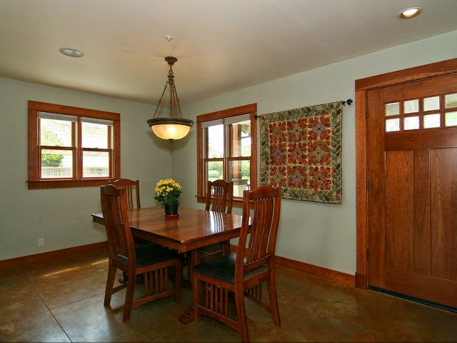
They bought their recent Craftsman-style home from the contractor who had designed and built it for his family. While the house is extremely well made, the interiors were bland, as you can see from the "Before" photos below.
The only architectural work we did was to transform the den at the rear of the house into a television/garden room. My clients did not want the television to be on display, and from a design point of view, sticking a TV in an armoire just doesn’t cut it anymore. I recommended installing a hidden, mirror TV from
The Art of TV, along with accompanying invisible in-wall speakers. To do this, we removed an unnecessary small door in the corner of the room (there is another existing small door right next to it leading from the kitchen to the backyard) to free up the entire wall. Now, at the touch of a remote, what looks like a beautiful wall mirror mounted over a low Japanese tansu comes to life, and theater-quality sound magically floats out from the wall around it! Since we removed the small door, we replaced an existing bank of windows with glorious French doors to allow easy access to the garden. A warm color palette in the TV room, seen below, contrasts nicely with the greenery visible through the new French doors since the garden now plays such a prominent and important role in the design and ambiance of the room.
Above, you can see the custom wall mirror as an element of decor in the room. The carved bamboo-like frame is from
Larsen Juhl. The new Shinto media console is a place for my clients to display their collection of exquisite art pottery and ceramics.
Above, a SuperBright Samsung Smart television comes to life: TV when you want it, a mirror when you don't, solving the problem of "what to do with the television." The curry colored wall anchors the television within the space. My clients' striped silk and nettle woven rug is from Nepal.
Above, a large, custom sectional with nickel nailhead trim, and a leather topped/baseball stitched cocktail table add comfort and convenience. My clients can now host their movie group for movie night! Below, brightly colored custom pillows blend beautifully with some of my clients' textiles collected from around the world.
Photo by Jeff Fiorito
Photo by Jeff Fiorito
Photo by Jeff Fiorito
The warm woodwork was lost in a sea of beige. It felt heavy and clunky, and I was not at all a fan (I had actually considered painting out all the woodwork white). I knew the only way to make the woodwork succeed was to pair it with a color that would accentuate it, not make it blend. I chose a deep aqua color palette for the rooms at the front of the house which makes the woodwork sing. And we discovered a wonderful art niche over the living room fireplace that the previous owners had covered with a framed print.

The previous owners' arrangement of smaller yet oddly puffy pieces of furniture made the living room feel cramped. It may seem counterintuitive, but the best way to combat that feeling is to put larger pieces of furniture, properly scaled, in the space. When I use all the space in a design, the eye reads a larger expanse, making the room feel larger. Above, a generous three-cushion custom sofa in a luxurious Butternut chenille provides plenty of seating for guests to gather around the fireplace after dinner in the nearby dining room. And the niche above is now home to one of my clients' prized carved Asian figures.

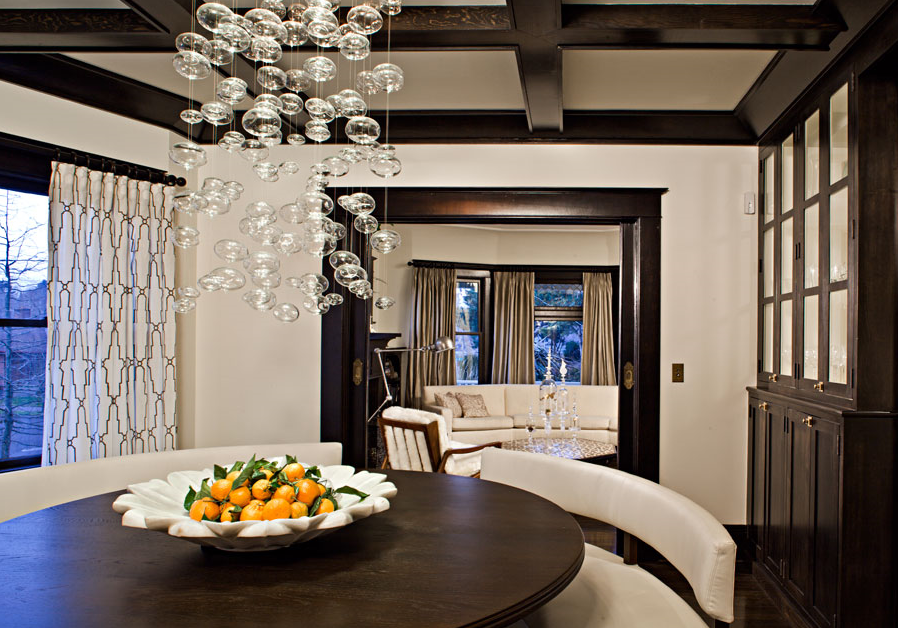
The aqua color palette continues throughout the space, visually connecting the living and dining areas. The color makes the woodwork seem richer, deeper, warmer. It now reads as a special element in the house and not simply "trim." Even the beautifully stained concrete floors (with radiant heat) look better. I replaced the old out-of-scale chandelier with a sleek, glass and marble slab light fixture that is more appropriately shaped for the space and echoes the Craftsman elements of the home. The table runner is a vintage embroidered textile from Turkey.
All "After" photos by Bernardo Grijalva except as noted.
Help with furniture placement or new pieces? Color selection? Art placement? Give me a call!
Happy designing!